
The Pinterest shot promised a gallery wall that read like an editorial spread, but my first attempt had frames hung three inches too high and half the photos crooked. I learned fast that small shifts matter more than brand new furniture, and that a few inexpensive swaps make a room feel current without starting over. Here are the ideas that actually work in lived rooms, not just in staged photos.
These ideas are not about buying everything new. They are for people who rent, move, or want a fresh feel on a budget. Most projects are weekend-friendly, some take simple tradespeople, and I tested several across three rentals so you get realistic steps that survive real life with pets and kids. Expect a mix of renter-friendly swaps, small carpentry, plus a few things worth hiring out.
1. Layered Rugs To Define Zones
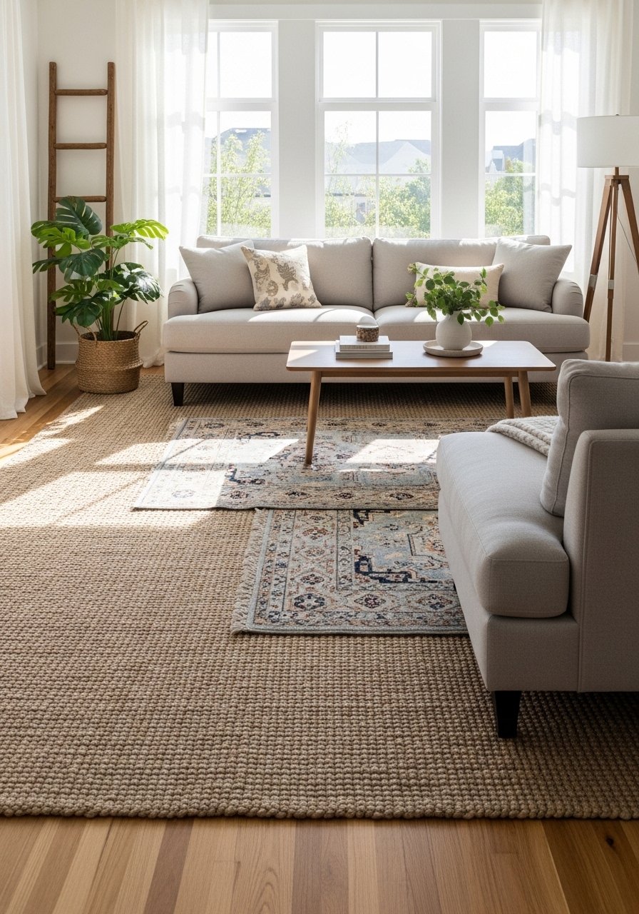
Start with rug size before pattern. I use a rule of leaving 12 to 18 inches of floor around the outer edge for a grounded feel, and I place the front legs of seating on the top rug so the room reads as one area. Layering a jute base with a softer wool runner adds texture and makes high-traffic zones feel intentional. This works in open-plan apartments and larger rooms, and it hides wear better than a single expensive rug. For budget, swap a handmade runner for a machine-made wool option. Try a jute area rug plus a wool accent rug.
Mistake to Avoid: Buying the patterned rug first, then trying to force a size that is too small for the seating group.
2. Low-Profile Sofas With Tall Legs For Air
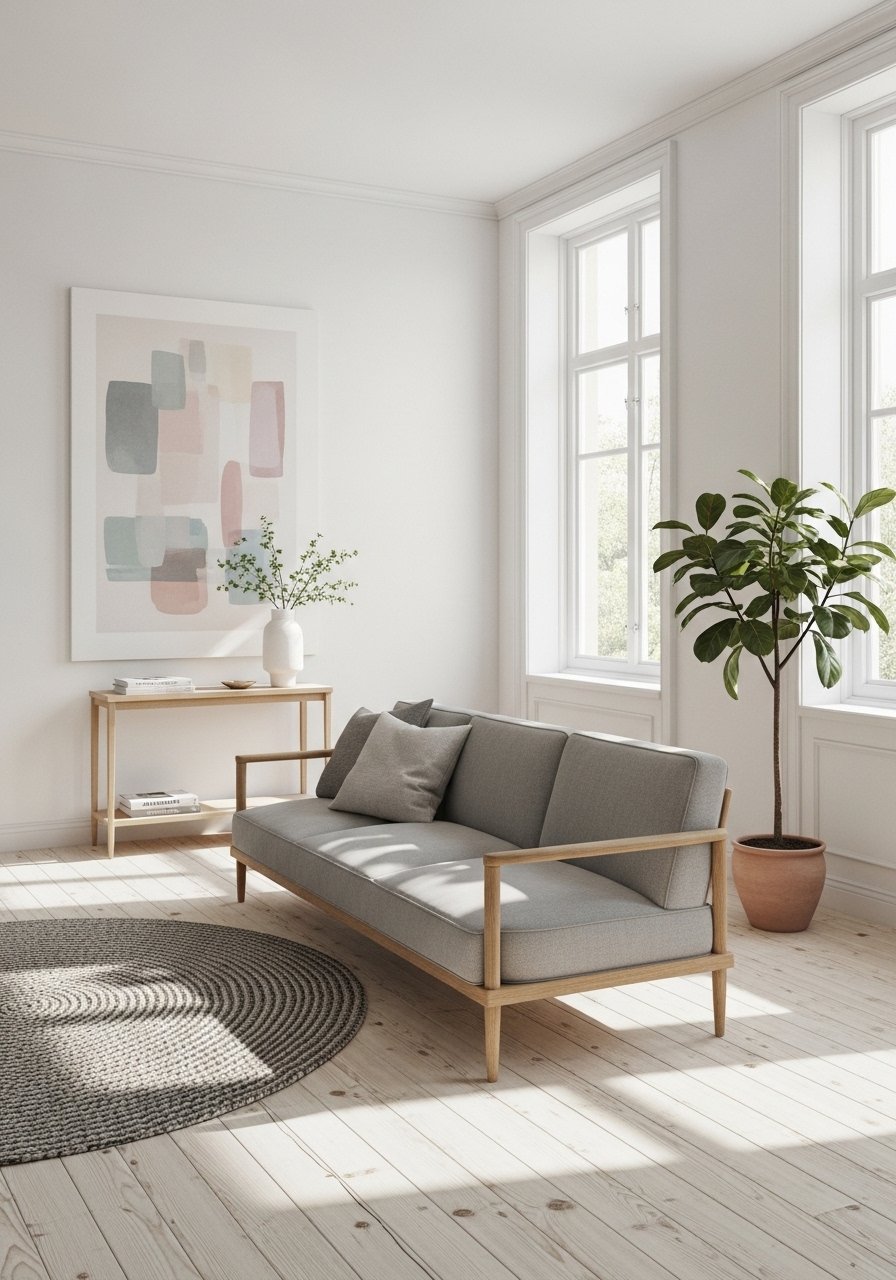
Sofas with visible legs create a feeling of space because you can see the floor under them. I swapped a bulky skirted couch for a mid-century modern piece with 6-inch legs and the room felt taller immediately. Aim for a sofa depth around 36 to 38 inches in smaller rooms so it does not overwhelm circulation. This style suits most body types with careful seat depth choice, and it is easy to move when you rent. For a budget-friendly option, consider a mid-century sofa with removable cushions.
Mistake to Avoid: Choosing a deep, overstuffed sofa without measuring walkway clearances first.
3. Warm Lighting Layers, Not One Overhead Fixture
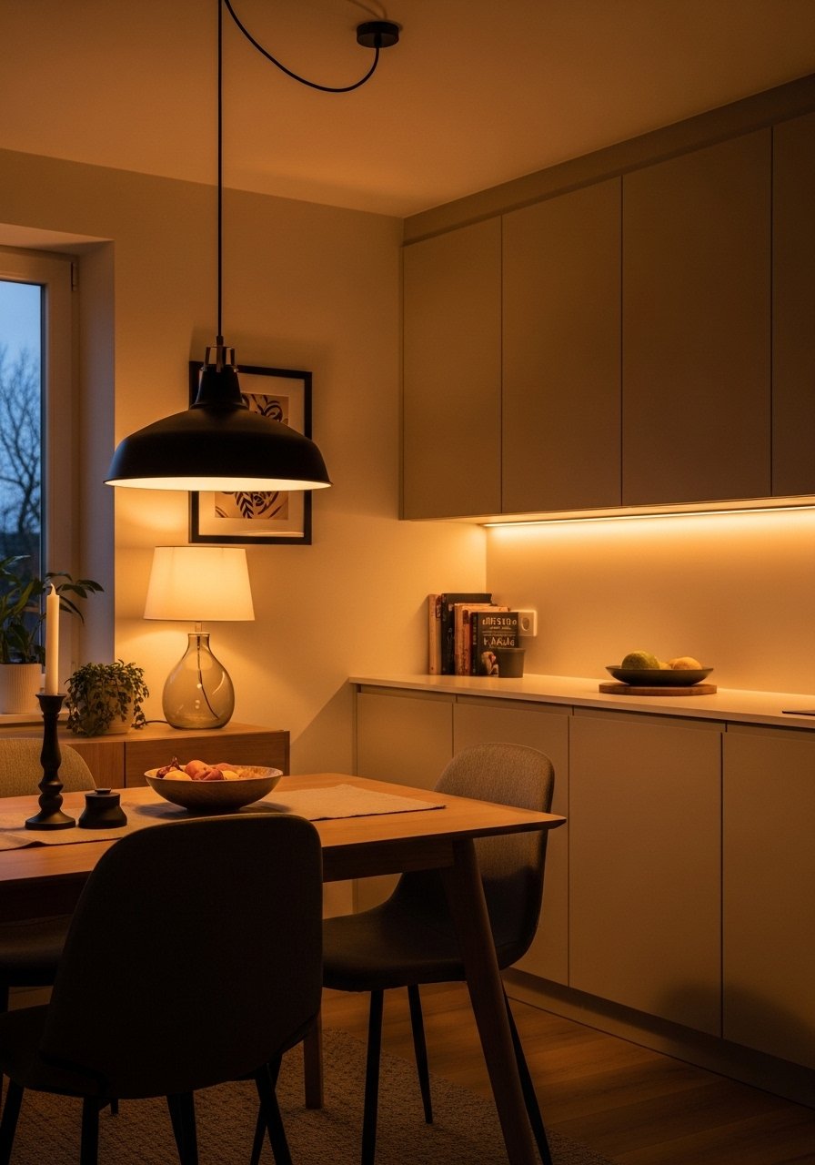
I stopped relying on one chandelier and started mixing table lamps, adjustable wall sconces, and a dimmable overhead. Use warm 2700K bulbs in living areas for a comfortable glow. Put a lower watt lamp behind seating to create depth, then add one task light for reading. I wire most fixtures for dimmers so moments go from bright morning to soft evening with a single switch. Try a dimmable LED bulb pack and a plug-in wall sconce.
Mistake to Avoid: Buying bulbs by lumen alone, not checking color temperature to match existing lighting.
4. Open Shelving With Negative Space
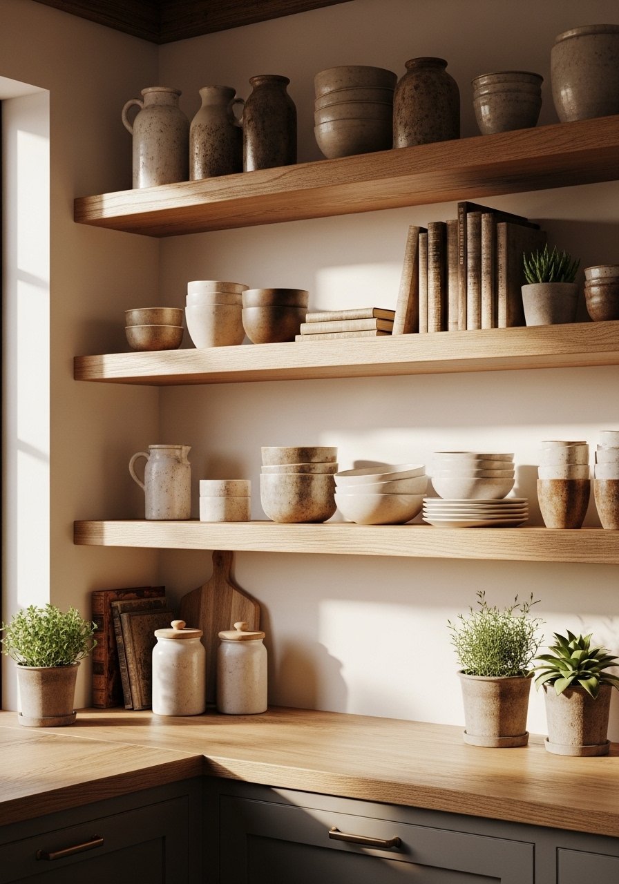
Open shelving is popular but often turns into clutter. The trick is deliberate negative space: display groups of three to five objects and leave breathing room between stacks. I keep daily dishes on the lower shelf and rotate decorative pieces seasonally on the top. For renters, use floating shelves installed into studs or secure with strong anchors for safety. Pair with a matte finish to keep the look modern. I use a floating shelf kit for easy installs.
Mistake to Avoid: Filling every shelf to the edge, which makes the space feel messy instead of curated.
5. Paint Trim In a Deeper Tone
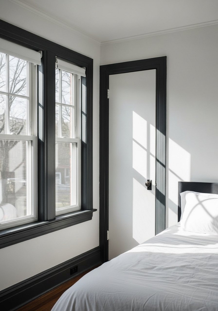
Instead of repainting entire rooms, paint trim or doors a deeper color to add contrast. I painted inner door frames and baseboards a charcoal tone and the whole apartment read as more intentional. This costs under one weekend and works in both modern and traditional spaces. For renters, use removable peel-and-stick paint film on doors or check with landlords. Use satin sheen for trim for easy cleaning. I used a satin trim paint that covered in two coats.
Mistake to Avoid: Using high-gloss trim paint in a way that highlights every imperfection on older woodwork.
6. Swap Hardware For Immediate Personality
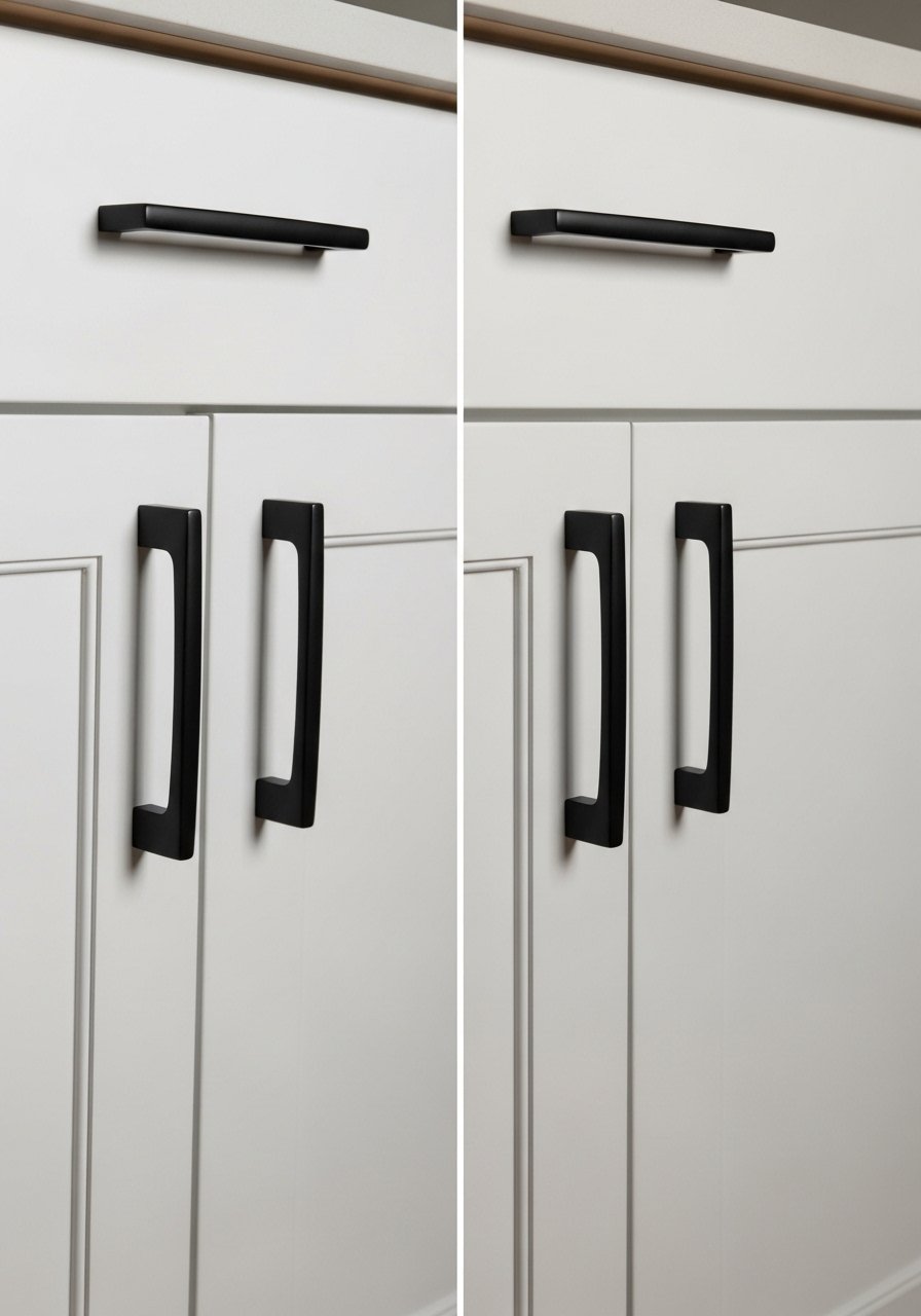
Switching drawer pulls and door knobs updates a whole kitchen for the price of one splurge piece. Pick a finish and repeat it across cabinets, lighting pulls, and switchplates for cohesion. I swapped brass knobs for satin black across two rentals and the kitchens read contemporary and lived-in. Use the 3-inch center-to-center measurement to match existing holes and avoid drilling new ones. A matte black cabinet pull set makes the job fast.
Mistake to Avoid: Mixing too many finishes, which fragments attention rather than creating a unified look.
7. Layered Window Treatments For Texture and Privacy
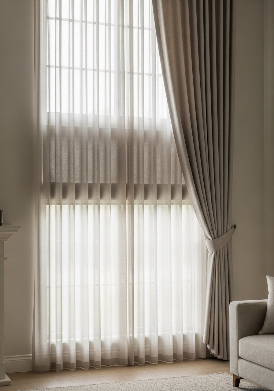
Pair a lightweight sheer with a heavier outer panel so you get daylight and privacy without losing warmth. Hang the rod 6 inches above the window frame and extend it 4 to 6 inches past each side so curtains read wall to wall. Linen sheers soften harsh light, and a thermal blackout helps with winter heat and noise. For renters, use tension rods or a simple bracket that can be patched. A linen curtain set plus blackout panels covers most rooms.
Mistake to Avoid: Hanging curtains inside the frame, which makes windows look smaller and rooms feel boxed in.
If any of these ideas have you ready to shop, here are the essentials I reached for across most projects.
Picks For 2025 Home Updates
Textiles & Soft Goods:
- jute area rug (~$80-200). A tough base layer that hides traffic.
- linen curtain set (~$30-70 per panel). Adds relaxed texture.
Hardware & Lighting:
- matte black cabinet pull (~$12-25 per set). Quick kitchen update.
- dimmable LED bulb pack (~$15-30). Warm light without wiring.
Storage & Shelving:
- floating shelf kit (~$20-50). Secure and renter-friendly.
- wool accent rug (~$60-180). For layering and comfort.
- plug-in wall sconce (~$40-90). Adds mood without hardwiring.
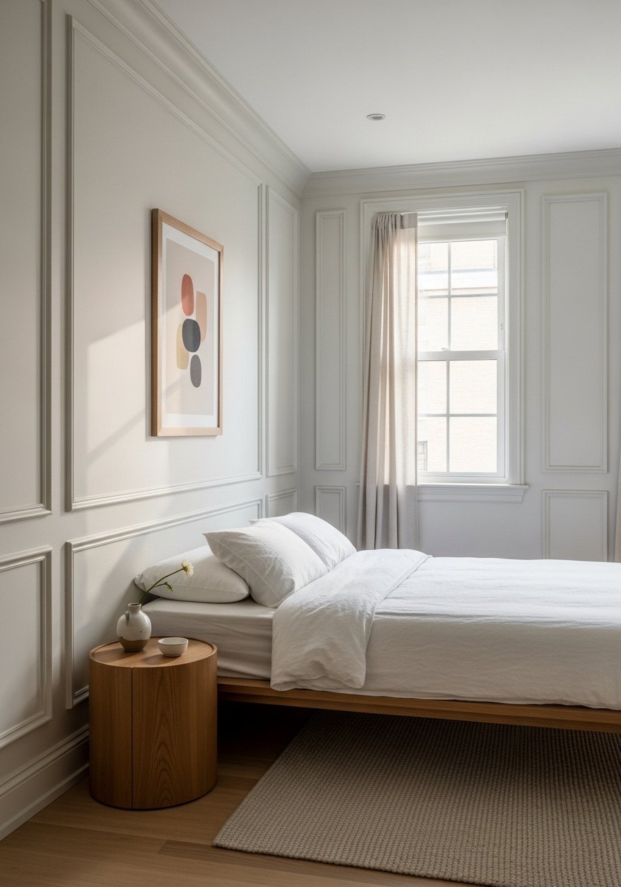
8. Art With Architectural Spacing
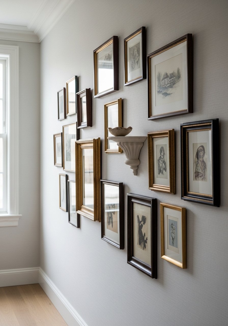
When building a gallery wall, place the center at eye level, about 57 inches from the floor, and space frames 2 to 3 inches apart for a dense look or 4 to 6 inches for a relaxed feeling. Mix scales and include one sculptural shelf to catch light and cast a shadow. I draft layouts on kraft paper or use painter's tape templates before hammering. For renters, use picture-hanging strips for small frames. I used a gallery frame set and a shelf ledge.
Mistake to Avoid: Starting with same-size frames and spacing them too widely, which reads as unfinished rather than curated.
9. Built-In Feel With Simple Trim
You do not need full carpentry to create a built-in look. Adding picture-frame molding and painting it the wall color adds depth and refinement. I measure panels to be roughly one-third of the wall height for balanced proportion and use 1×3 or 1×4 trim pieces fastened with liquid nails and a few brads. This is partial renter-friendly if you use removable molding in temporary spaces. A trim paint kit helps match sheen.
Mistake to Avoid: Making panels too small and busying the wall, which shrinks the perceived space.
10. Scale With Mirrors, Not More Stuff
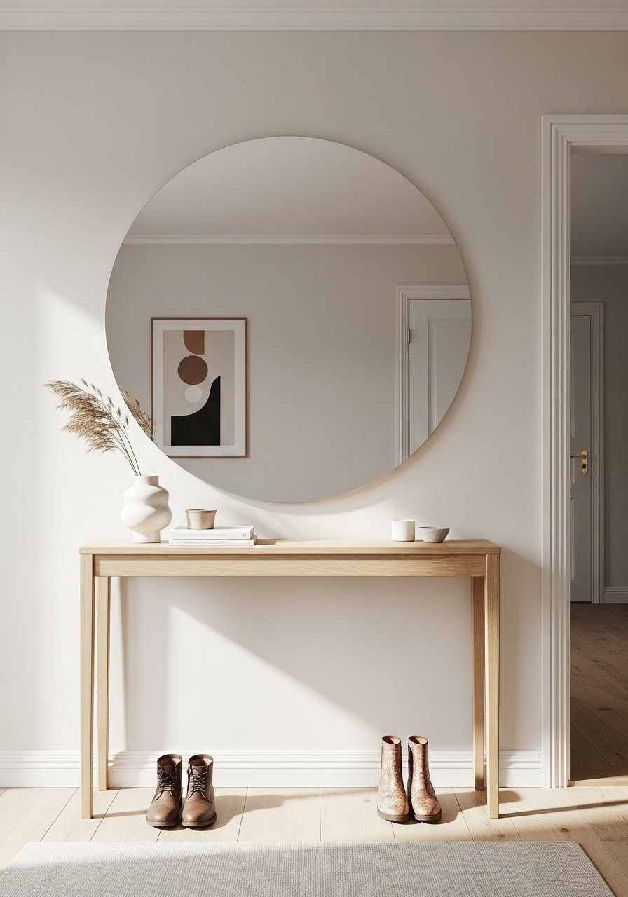
A well-placed mirror multiplies light and visually enlarges a room. Match mirror diameter to about two-thirds the width of the console or dresser below. Leaning a mirror on a mantel works for rented spaces and avoids extra holes. For bathrooms, choose an anti-fog backed mirror that handles steam. I replaced several small decorative pieces with one single larger mirror and the entryway finally read complete. Try a large round mirror.
Mistake to Avoid: Hanging a tiny mirror above a wide console, which looks unbalanced and fussy.
11. Intentional Entry Point With a Catch-All Surface
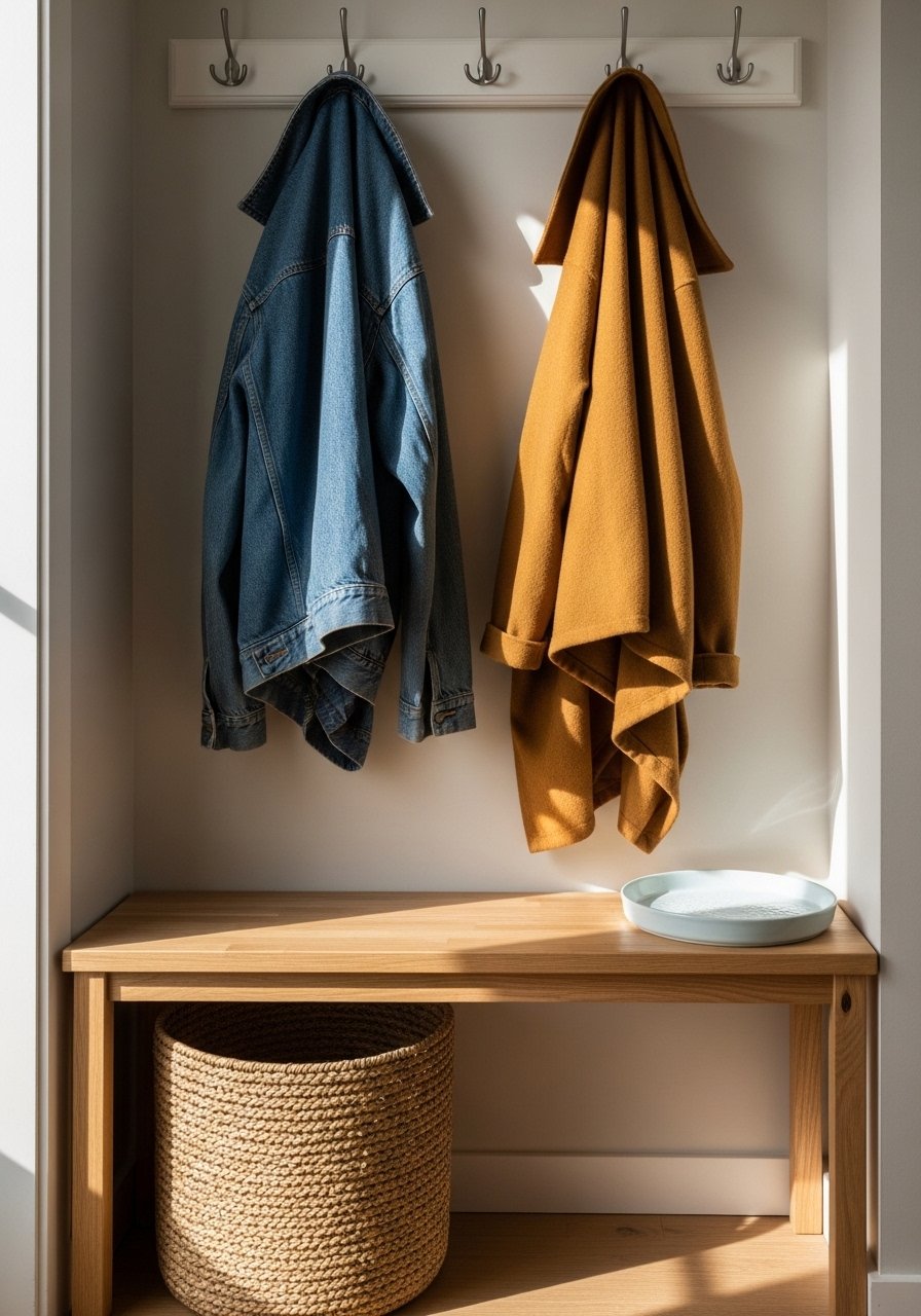
Make the first 6 to 8 feet of sight feel curated. A narrow bench or console, a hook rail, and one catch tray are enough to handle daily drop-offs. I keep a woven basket for shoes and a tray for keys and mail so clutter is contained. Choose materials that tolerate dirt. For small spaces, swap a bench for a floating shelf and add a plug-in sconce. Consider a woven storage basket and a slim entry bench.
Mistake to Avoid: Putting a table that is too deep in the entry, which blocks traffic and becomes a clutter magnet.
Lived Room Habits I Actually Use
Thin coats beat one thick coat every time. When painting trim or touching up walls, two thin layers of satin trim paint look smoother than one sloppy heavy coat.
Grab command picture hanging strips if you rent. They are easy to remove and let you experiment with gallery layouts without new holes.
Curate by subtraction. If a room feels busy, remove 30 percent of decorative items and keep the few that make you smile. A simple ceramic bowl can hold keys and instantly tidy a surface.
Most people hang art too high. Bring the center down to about 57 inches and the whole wall will read proportioned, especially in rooms with standard eight to nine foot ceilings. A laser level tool makes this fast and accurate.