
My saved board had fifty photos of pale linen sofas that looked impossible to live on. Each pin promised calm and then the couch betrayed crumbs, pets, and weekend chaos. What finally worked was swapping one idea for a practical tweak, then another, until the room looked deliberate without feeling staged.
These ideas are not high-end showroom tricks. They are low- to mid-budget moves that read elegant but survive kids, pets, and rentals. I tested many in three rentals and kept what worked: simple carpentry for a built-in look, rug placement rules that actually save money, and lighting layered so evenings feel intentional. Expect projects that range from ten minutes to one weekend, with renter-friendly alternates noted where relevant.
1. Anchor Rug With the 2:3 Rule
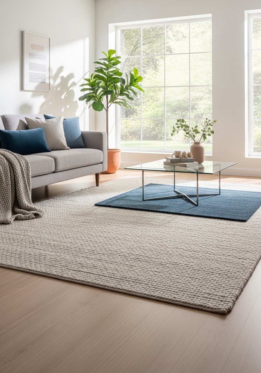
Place the rug so at least the front two legs of each main seat sit on it. I use a visual 2:3 rule where the rug covers roughly two thirds of the sofa length in front, leaving a border of floor to breathe. It makes the seating read intentional, not shoved. Works for modern and traditional styles. Budget option: a flatweave rug. Pet-friendly note: choose low pile and darker tonal weaves. Try a wool blend rug for texture and durability.
Mistake to Avoid: Choosing a rug that is too small, making seating look disconnected.
2. Layer Textiles, Not Patterns
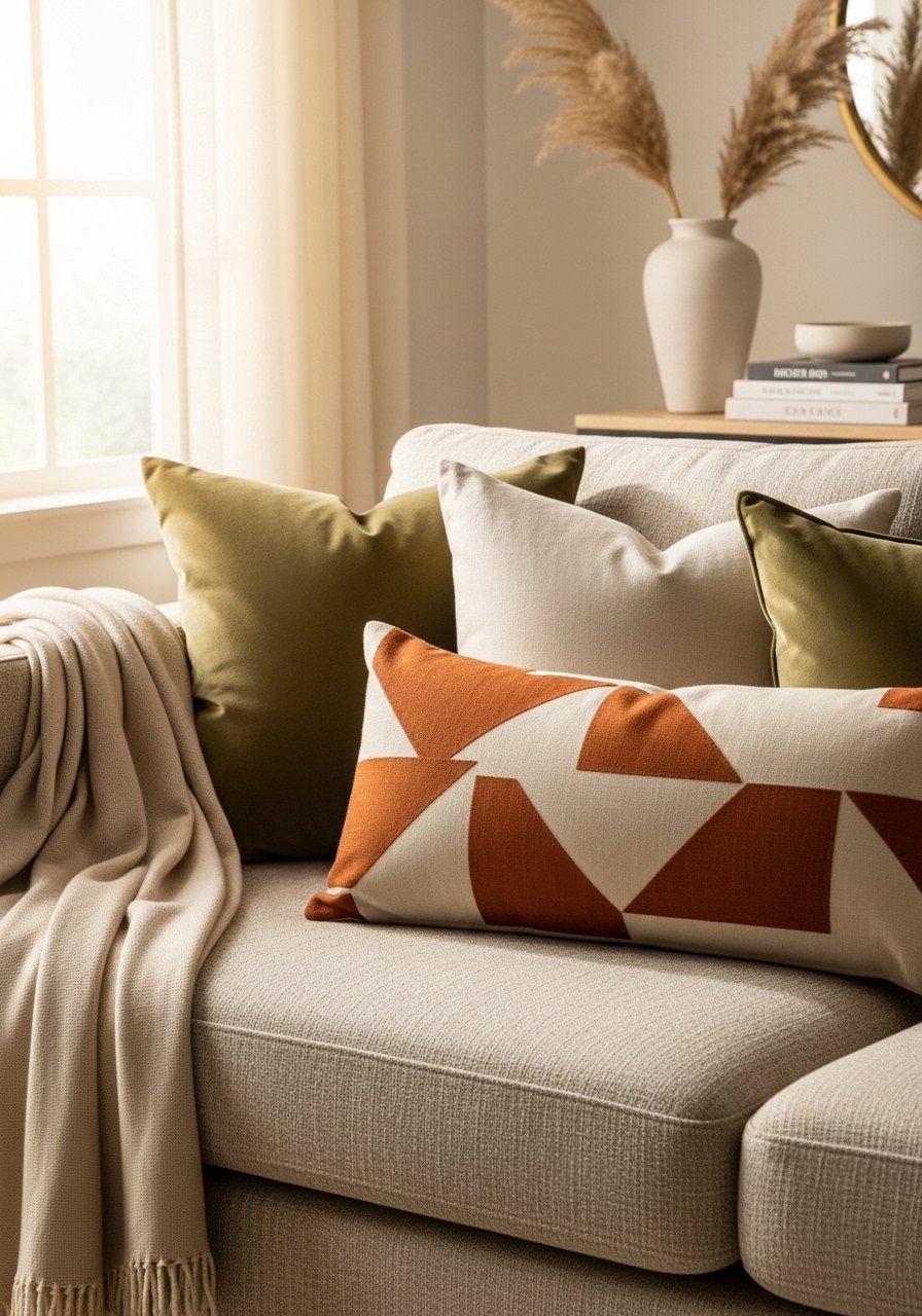
Layer a mix of velvet, linen, and a single patterned lumbar. The trick is keeping all textiles within a tight color family and varying scale. Velvet reads luxe, linen keeps it relaxed, and one patterned piece adds personality. I swap pillow sizes so there is one oversized square, one standard, and a long lumbar. For rentals, pick pillow covers you can switch seasonally. I often use a velvet throw pillow and a linen pillow cover to get the mix.
Mistake to Avoid: Buying five small pillows that clutter the sofa instead of three varied ones.
3. Sculptural Side Tables as Mini Art
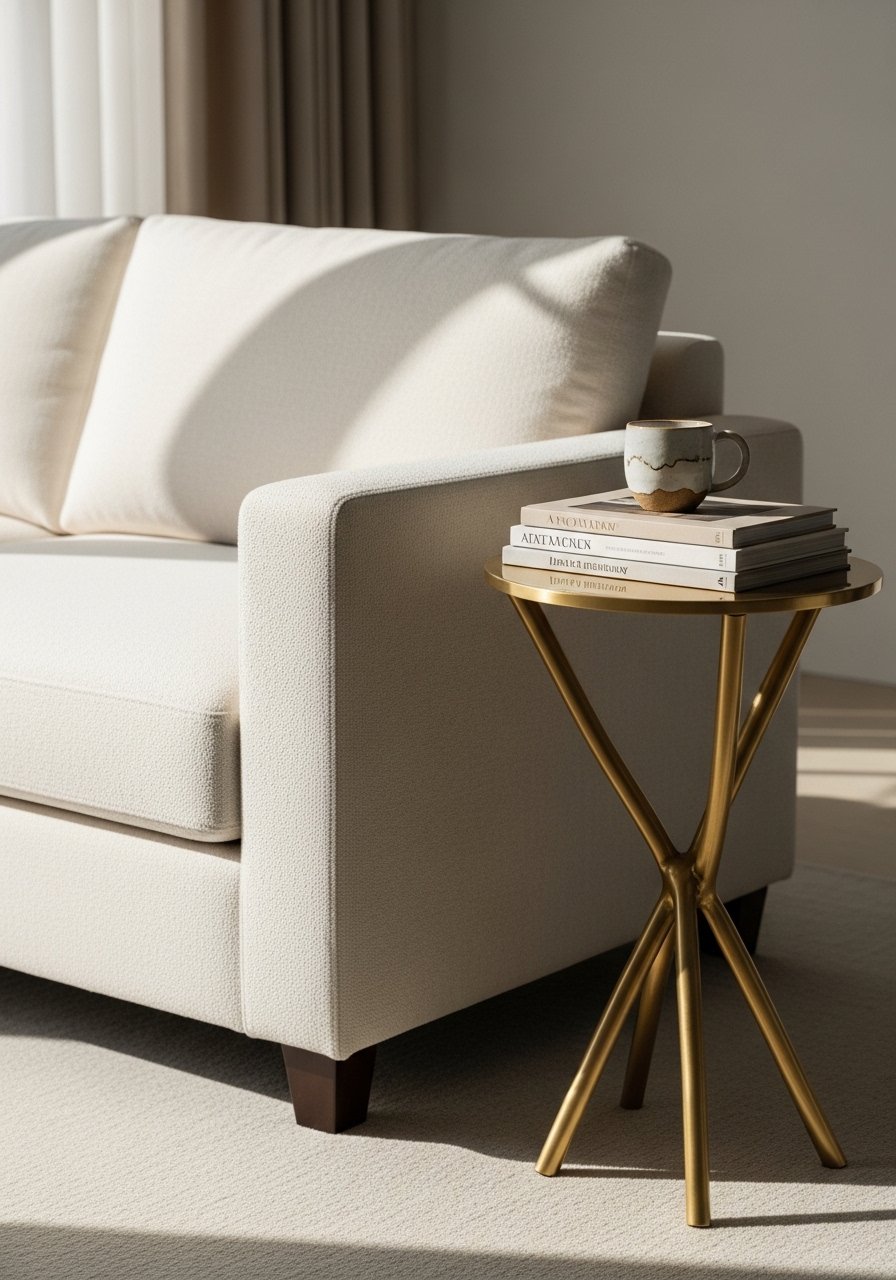
Swap a matchy set of side tables for one sculptural piece that reads like an object. A single statement table breaks the monotony and doubles as art. Choose brass, walnut, or a molded composite depending on your finish mix. Small-space alternative: a slim table with a tapered base. If you have kids, pick a rounded edge version. I like pairing a sculptural table with a brass nesting table for flexibility.
Mistake to Avoid: Matching both side tables exactly, which makes the room feel showroom instead of lived in.
4. Conceal the TV With Panels or a Sliding Frame
Instead of centering decor around the TV, hide it. Sliding panels or a simple framed cover gives the wall a focal point when the screen is off. It cost me under a weekend and it changes how guests arrive into the room. Renter-friendly option: a lean-to framed panel on a floor stand. Keep cable clutter behind a slim media cabinet. For a quick cover, use a wooden sliding panel kit.
Mistake to Avoid: Decorating around the TV as if it is the artwork, which limits styling options.
5. Layer Lighting for Depth
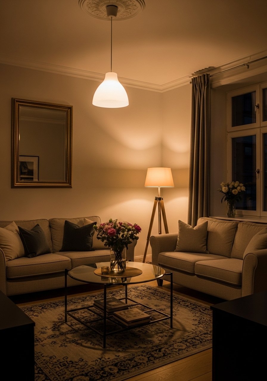
Good rooms have multiple light sources: overhead, task, and accent. I aim for three layers and dimmers where possible. Use a warm bulb temperature to keep surfaces flattering. For renters, plug-in sconces and a tall floor lamp create the same effect without rewiring. Try a torchiere floor lamp and a plug-in wall sconce for easy layering.
Mistake to Avoid: Relying on a single overhead light that flattens the room.
6. Built-In Look With Floating Shelves
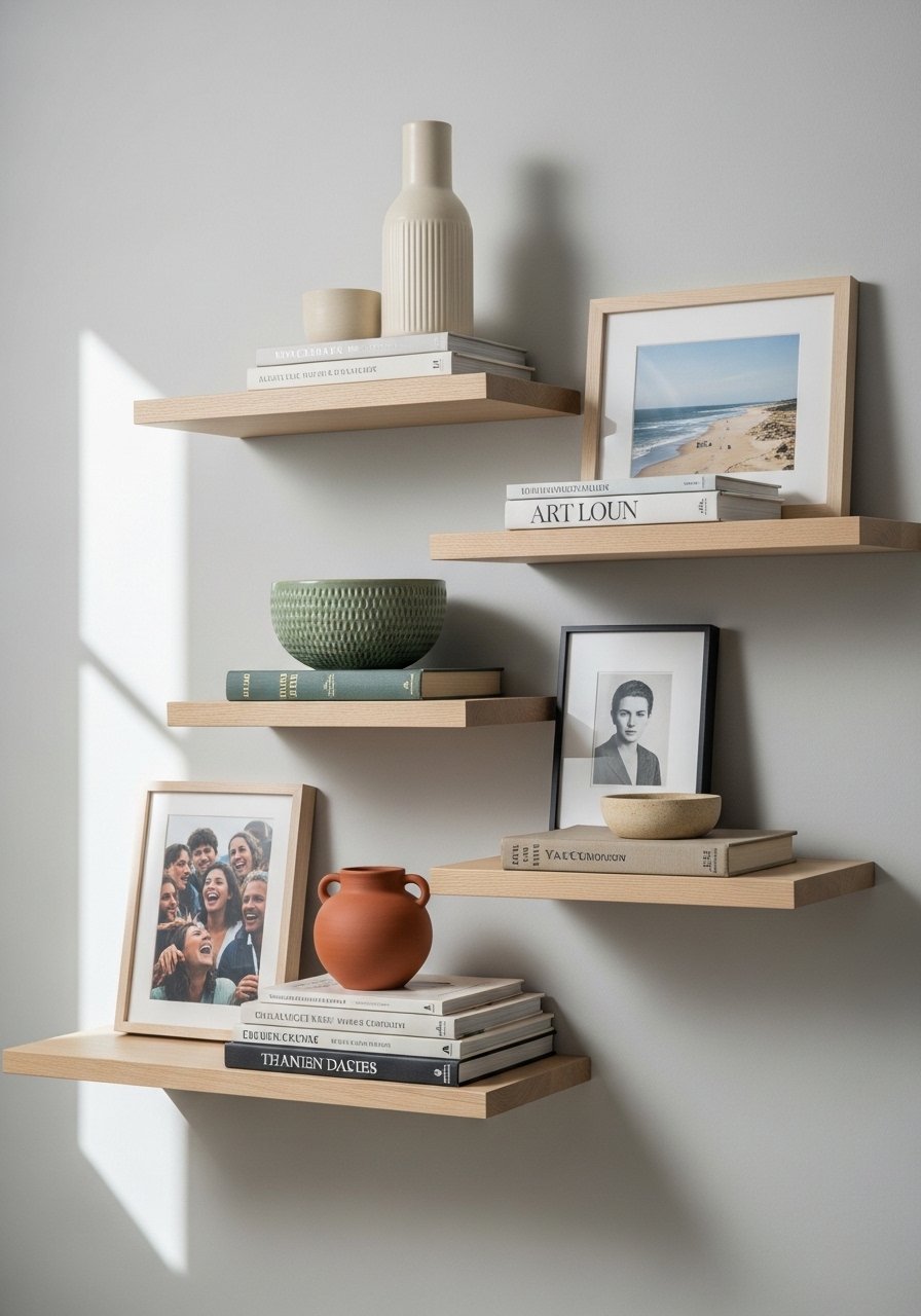
Floating shelves give instant cabinetry vibes without permanent work. Stagger shelves vertically and keep groupings odd numbered for balance. I style with a heavier object, two medium items, and a small accent to anchor each shelf. Renter-friendly tip: use toggles rated for your wall type and keep heavier pieces low. A sturdy floating shelf bracket set makes installation straightforward.
Mistake to Avoid: Filling shelves with objects of the same height, which reads like clutter.
7. Sculptural Planters for Height and Line

Add a tall plant on a plinth or stand to introduce vertical line without adding furniture. The planted plinth makes the corner feel curated and intentional. Small-space version: a slim metal stand with a trailing plant. If you have pets, pick non-toxic plants like ponytail palm or a rubber tree. I often use a ceramic planter with stand to get the scale right.
Mistake to Avoid: Tucking the plant behind furniture where it disappears, losing the vertical drama.
If any of these are making sense, here are the pieces I reach for when I actually redo a sofa wall.
Living Room Starter Finds
Textiles & Soft Goods:
- Honestly the easiest swap for a fresher feel, velvet throw pillow (~$20-35).
- For durable layering, wool blend area rug (~$120-300).
Lighting & Tables:
- For layered light without wiring, torchiere floor lamp (~$60-120).
- A compact statement table like a brass nesting table (~$70-150).
Shelving & Plants:
- Strong hardware for renters, floating shelf brackets (~$15-30).
- A neutral planter that reads elevated, ceramic planter with stand (~$40-90).
TV & Media:
- Quick conceal solution, wooden sliding panel kit (~$80-200).
- Cable management for a neater look, cable raceway kit (~$12-25).
Misc:
- For styling and layering, stacking decorative boxes (~$25-50).
- A durable throw that softens corners, chunky knit throw (~$30-80).
8. Low Molding for High-End Lines
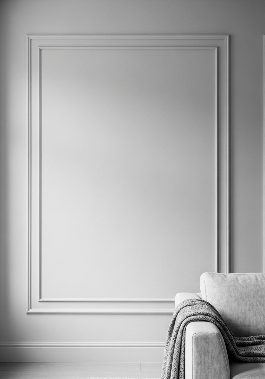
Adding low, flat picture-frame molding around the room creates shadow lines that read like custom millwork. Paint it the same color as the wall for a subtle, elevated look. This is a weekend project and works on most rental walls if you use small nails and spackling on exit. For a painted furniture feel, match the molding color to a trim sample. Try a painter's caulk and trim kit for clean seams.
Mistake to Avoid: Using ornate molding that clashes with streamlined furniture and feels dated.
9. Gallery Shelf Instead of Gallery Wall
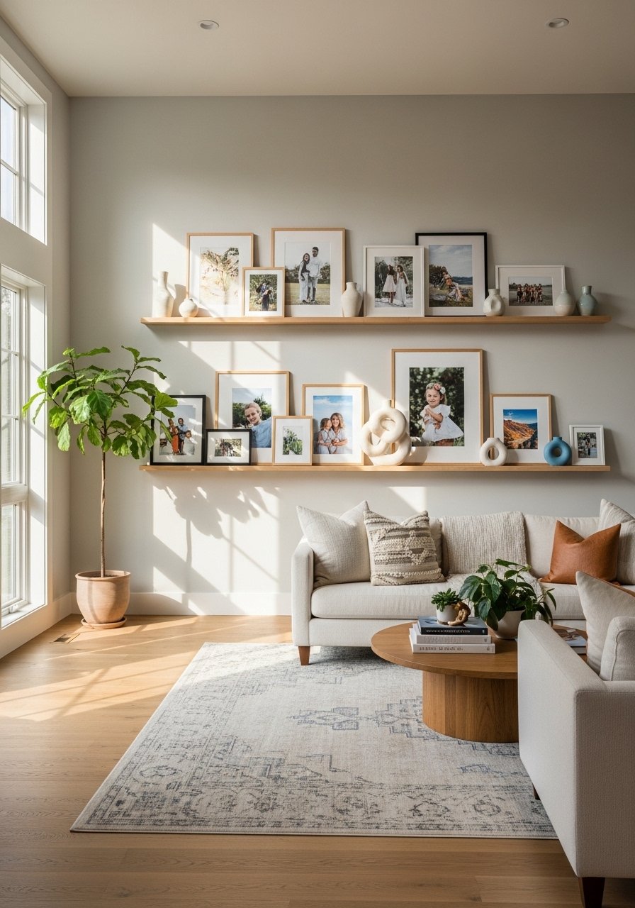
A single gallery shelf is easier to install and way more flexible than individual frames. Lean frames in layers and swap pieces seasonally without patching dozens of holes. Keep frames in two finishes to avoid visual chaos. Small-space tip: a narrow picture ledge keeps the wall interesting without overwhelming scale. For an instant update use a picture ledge shelf.
Mistake to Avoid: Trying to perfectly center many frames, which ends with uneven nails and frustration.
10. One Jewel Accent, Rest Neutral
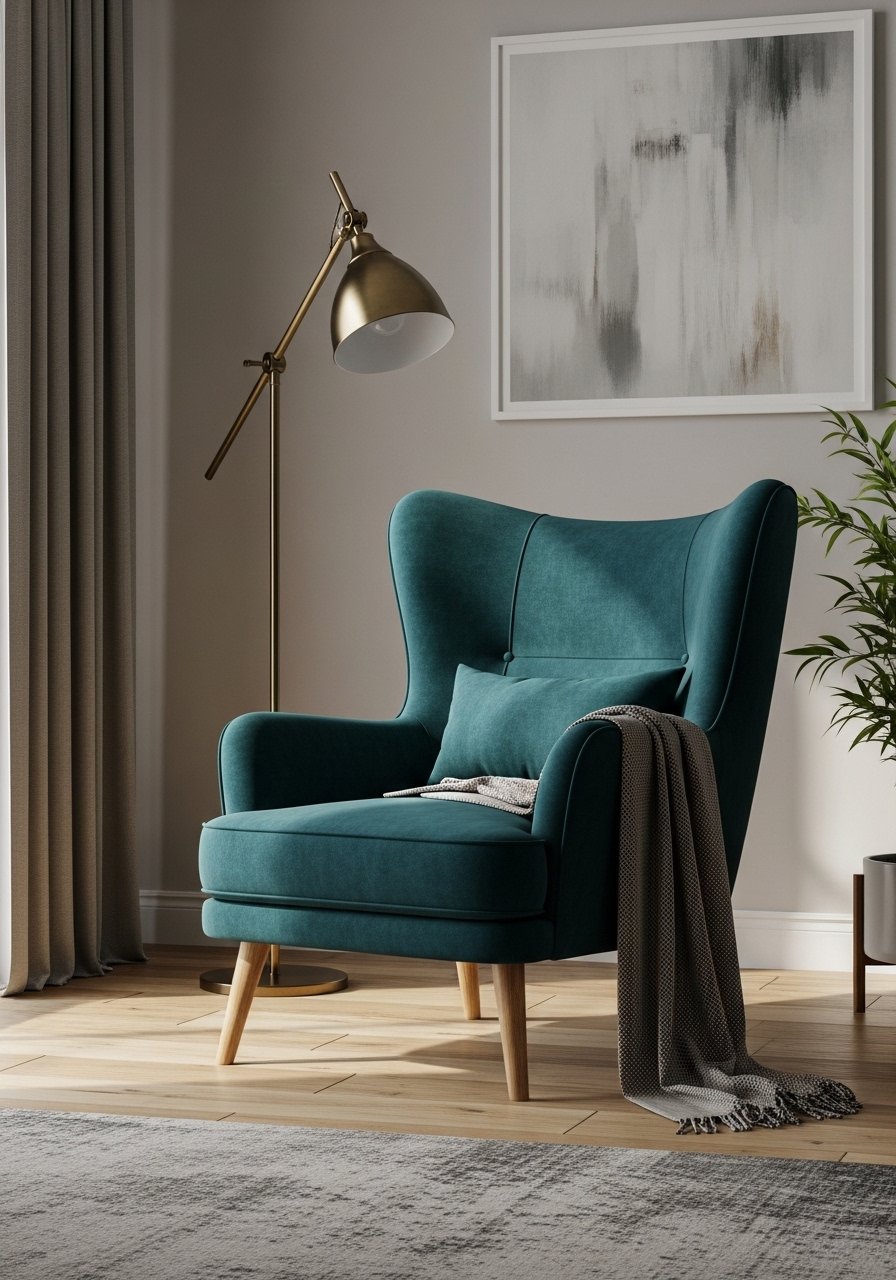
Pick one saturated piece such as a jewel-toned chair or ottoman and keep the rest quiet. The single color reads intentional and prevents the room from feeling fussy. This works across budgets, from thrifted chairs to new upholsteries. For families, pick a stain-resistant fabric or a slipcovered version. A well-chosen teal accent chair can anchor the scheme.
Mistake to Avoid: Introducing several competing bright colors that make the space look cluttered.
11. Modular Seating for Flexibility

Modular pieces let you adapt the layout for guests, movie nights, or a cleared play space. I repurposed the ottoman as extra seating during a dinner once. For small rooms, pick low-profile modules so sight lines stay open. Budget alternative: pair a small sofa with movable lounge chairs. A modular sofa section is a long-term investment for flexible living.
Mistake to Avoid: Getting stuck in one layout that does not reflect how you actually use the room.
12. Layer a Low Coffee Table and Ottoman
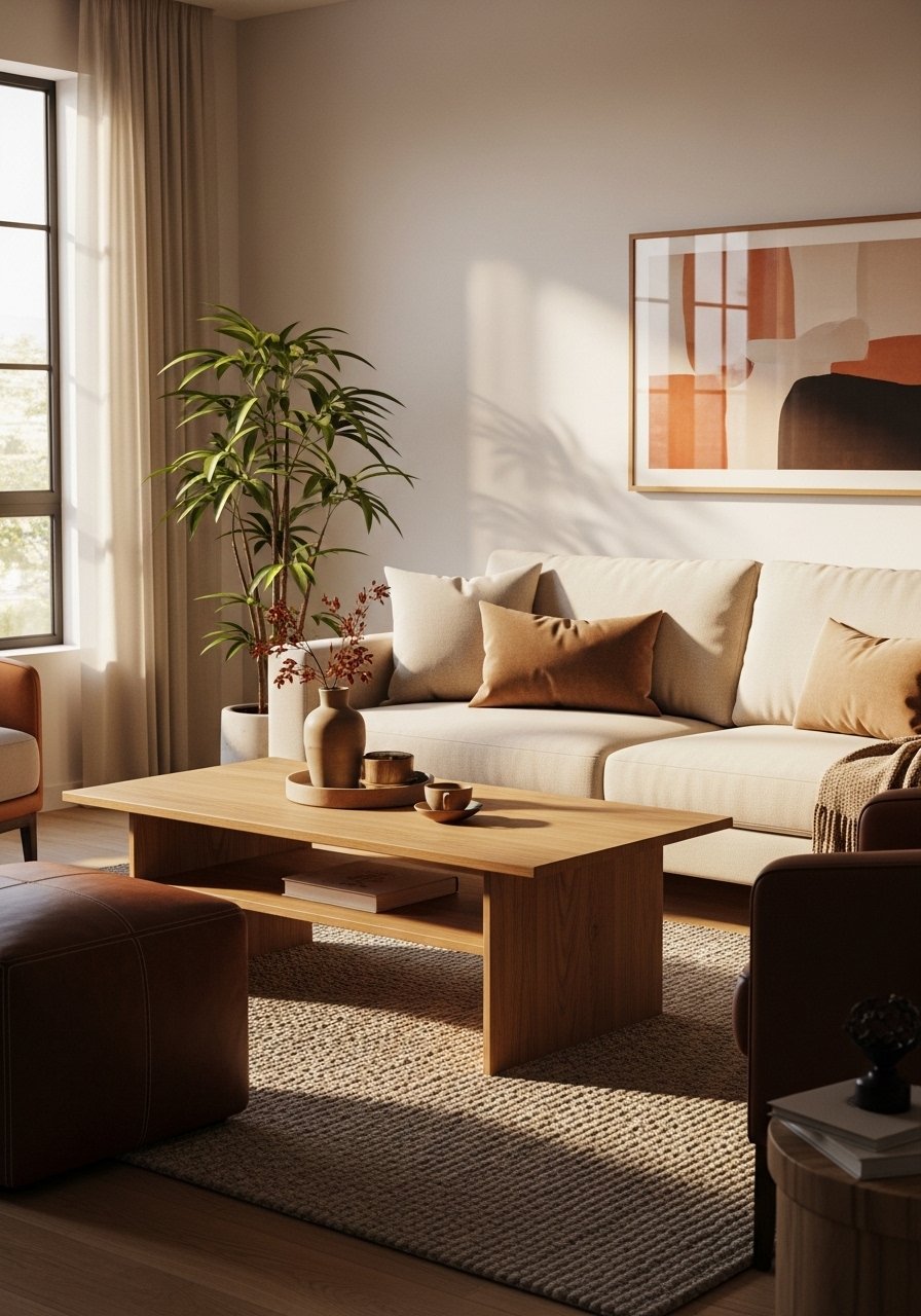
Combine a low coffee table with an ottoman to soften edges and increase seating. The ottoman can be moved for extra seating, a footrest, or a kid's tabletop with a tray. Aim for a two-thirds table height compared to sofa seat height for comfortable reach. Leather or stain-resistant fabric keeps this setup practical. I often style with a round wood coffee table.
Mistake to Avoid: Choosing two pieces the exact same size so they read redundant.
13. Keep a Curated Entry Corner
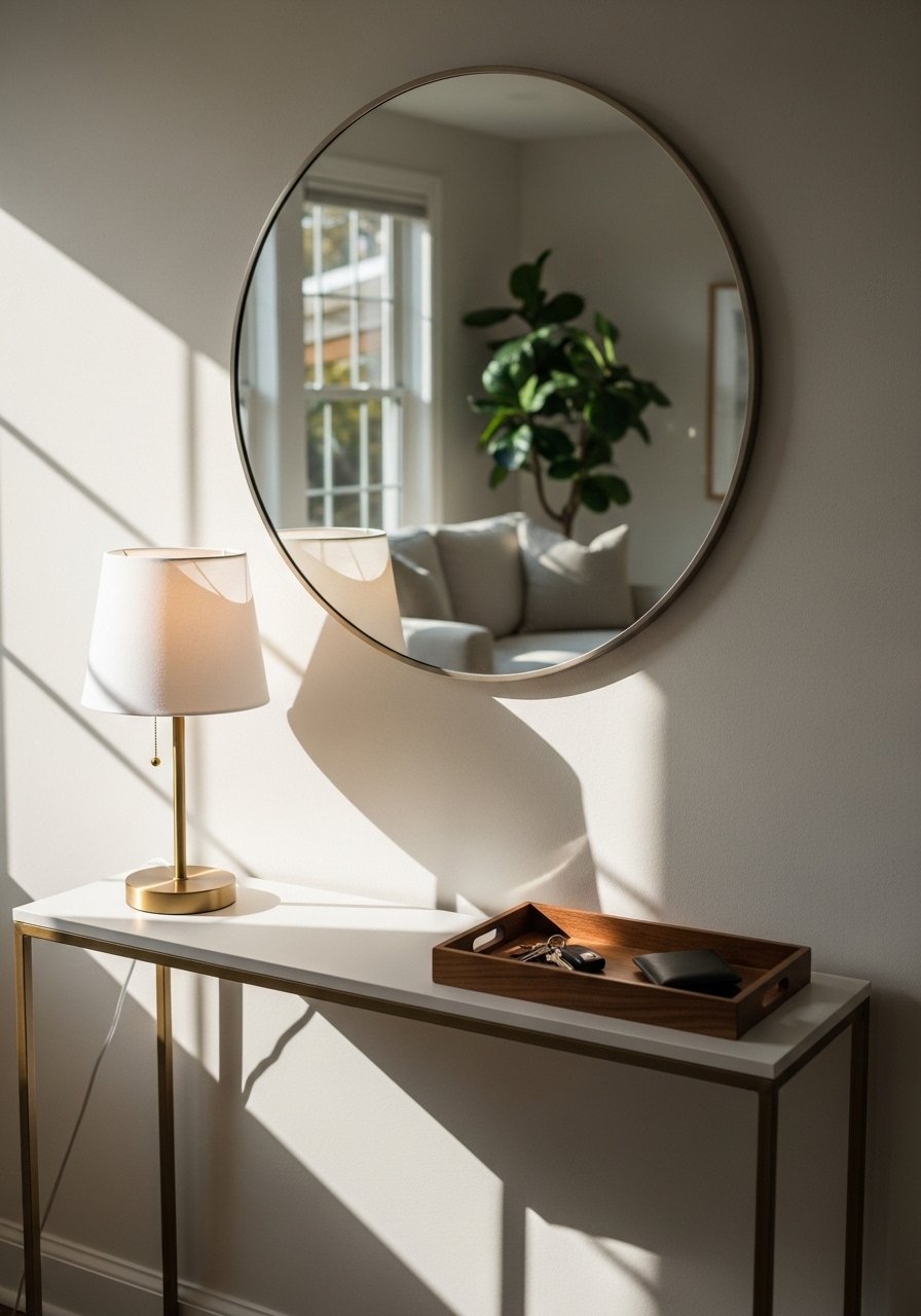
A small console by the entry to the living room keeps everyday clutter off the sofa and gives a place for keys and mail that still looks curated. Use a decorative tray, a small lamp, and a bowl for daily items. If you lack floor space, use a floating shelf at entry height. For durability choose an easy-clean surface. I recommend a slim console table that doubles as styling real estate.
Mistake to Avoid: Letting the entry become a drop zone, which makes the whole room feel messy.
Tiny Habits That Keep It Elegant
Bold finish matters more than perfect placement. A fresh coat of trim paint unifies the room. Use a satin trim paint to hide small flaws and make your molding read intentional.
Grab a plush doormat for the inside of the entry. A simple mat saves floors and stops dirt at the door, which keeps textiles cleaner and corners feeling calmer.
Most people pile half a dozen tiny decor objects. Replace them with one larger object like a ceramic vase, and the space reads calmer. I keep a large ceramic vase on rotation for seasonal stems.
Everyone leans too many frames up high. Keep your eye line at about 56 to 60 inches for hanging art. For easy swaps, order a set of picture hanging hooks so you can move pieces without a hardware hunt.