
I nearly tossed the living room rug and called it a day. It was frayed in the corners and held the imprint of three years of takeout boxes, but one small change and the whole room stopped looking patched together. A fresh texture, a lower sofa, and a deliberate light source made the apartment finally feel like it belonged to someone who actually lives there.
This list is for people who want a modern living room that reads intentional without feeling staged. Most ideas work in rentals and small footprints and skew budget-friendly where I note it. Expect simple measurements you can reproduce, a few splurge-for-life pieces, and renter-friendly swaps that still read 2025 modern.
1. Low-Profile Rounded Sectional
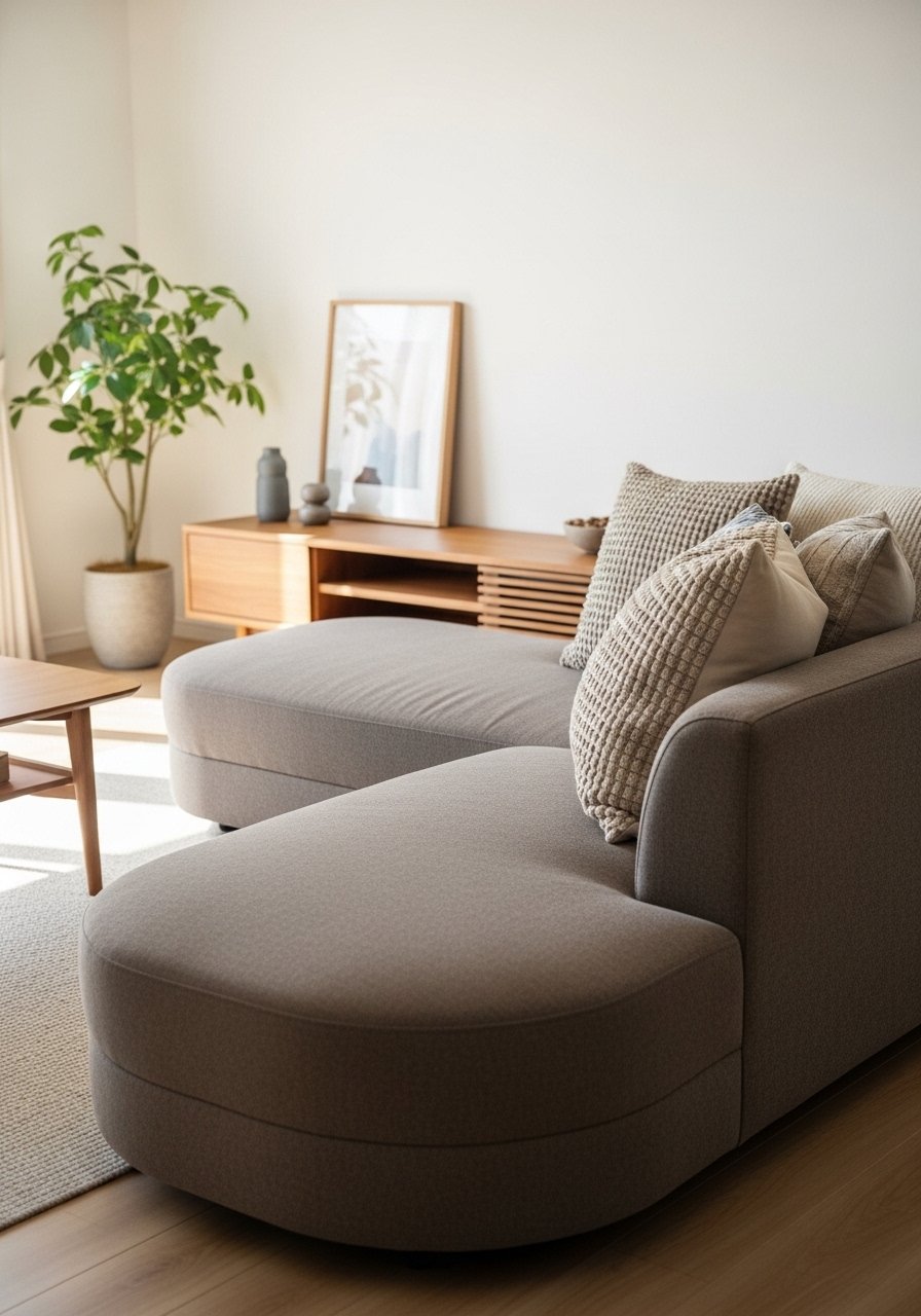
A rounded, low seat instantly modernizes a space because it softens hard angles and keeps sightlines open. Look for a seat height around 17 to 18 inches that lines up with coffee table surfaces. Visually this creates a loungey, grounded feel and fits small rooms because it does not tower. Pair with a slim console behind the sofa to create a walkway and use a 10 to 12 inch gap between sofa and console so the room breathes. I tested one in three rentals and it read clean every time. Try a fabric like performance linen for pets and spills.
Mistake to Avoid: Buying a deep, tall sofa that blocks windows and makes the room feel chopped.
2. Two-Tone Sofa Swap
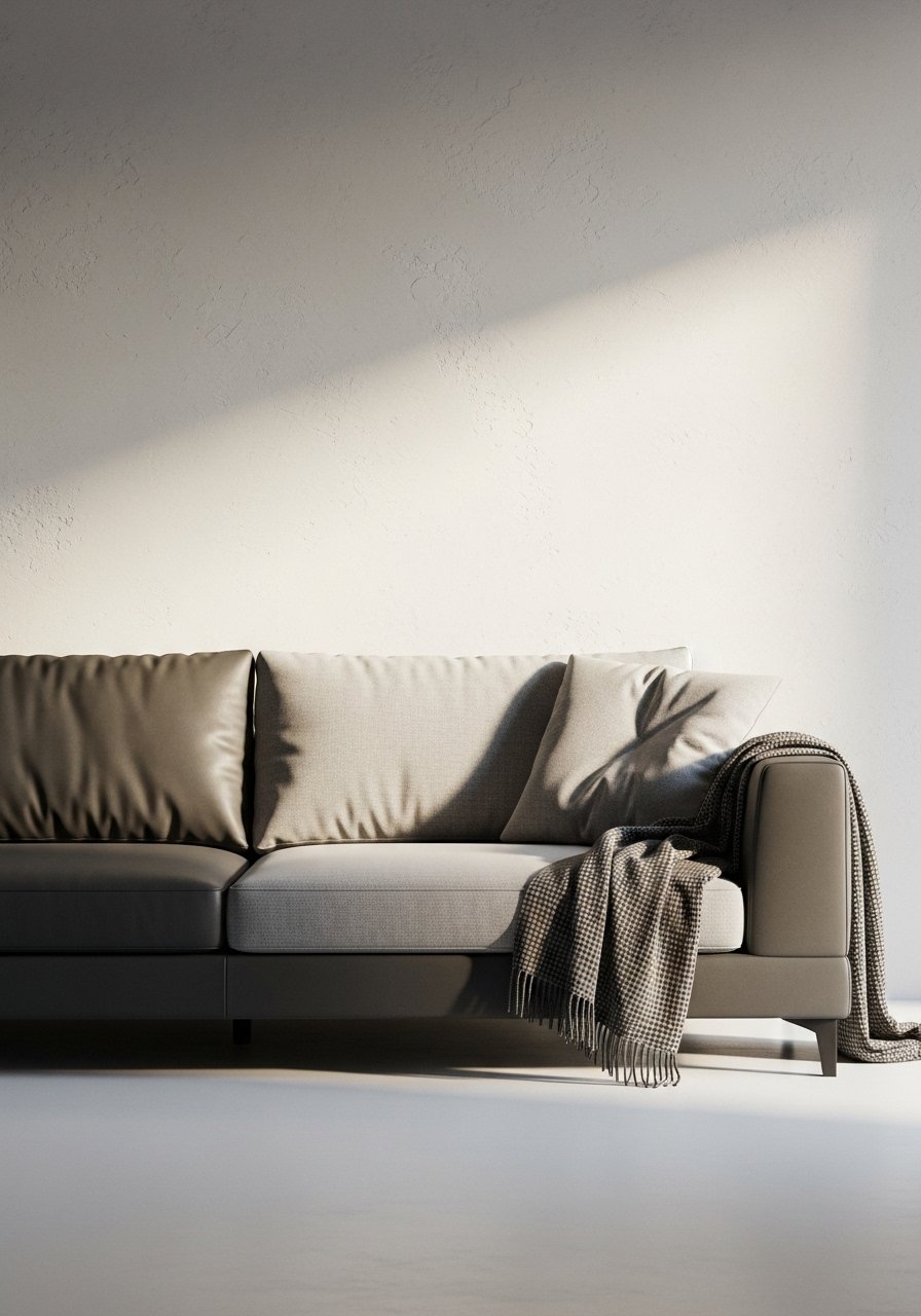
Instead of replacing the whole sofa, swap a seat cushion upholstery or add a leather base slipcover to introduce contrast without commitment. The two-tone effect gives depth and prevents a block of color that flattens photos. It reads modern and edited, and it is a good middle ground for anyone who wants a fresh look on a budget. Use color blocking roughly in a 60 percent base, 40 percent seat-and-cushion ratio for balance. This idea works well for families because dirt hides on darker bases.
Mistake to Avoid: Matching every soft furnishing to the sofa color, which creates a flat, catalog look.
3. Layered Rugs, Different Scales
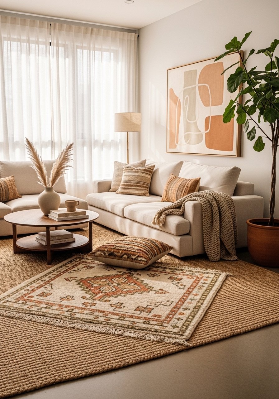
Layering rugs adds texture and anchors seating without needing a single oversized piece. Start with a base rug that covers at least the front two legs of major furniture pieces, then place a smaller rug centered under the coffee table. Use a ratio where the smaller rug is about 50 to 70 percent the size of the base rug so the layers read intentional. This creates a collected, lived-in atmosphere and is perfect for renters who want pattern without committing to one big investment.
Mistake to Avoid: Choosing two rugs that fight scale and pattern, which makes the floor feel busy instead of layered.
4. Hidden LED Cove Lighting in Molding
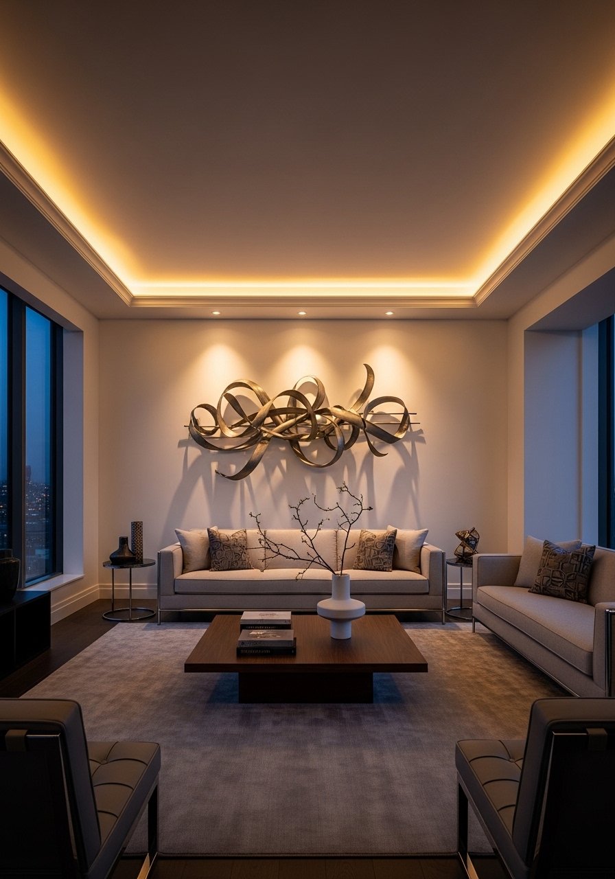
Hiding LED strips in existing crown molding or behind a floating shelf gives a soft ambient wash that photographs like a professional install. Use warm LEDs around 2700K to 3000K for cozy evenings. Keep strips dimmable and set them with a three-quarters brightness rule for living rooms to avoid glare. This is one of those small technical moves that feels expensive but is reversible in rentals if you use adhesive channels. It makes the space read layered and intentional in photos and in person.
Mistake to Avoid: Installing bright, cool-white LEDs that read clinical and flatten the room at night.
5. Modular Open Shelving With Style Boxes
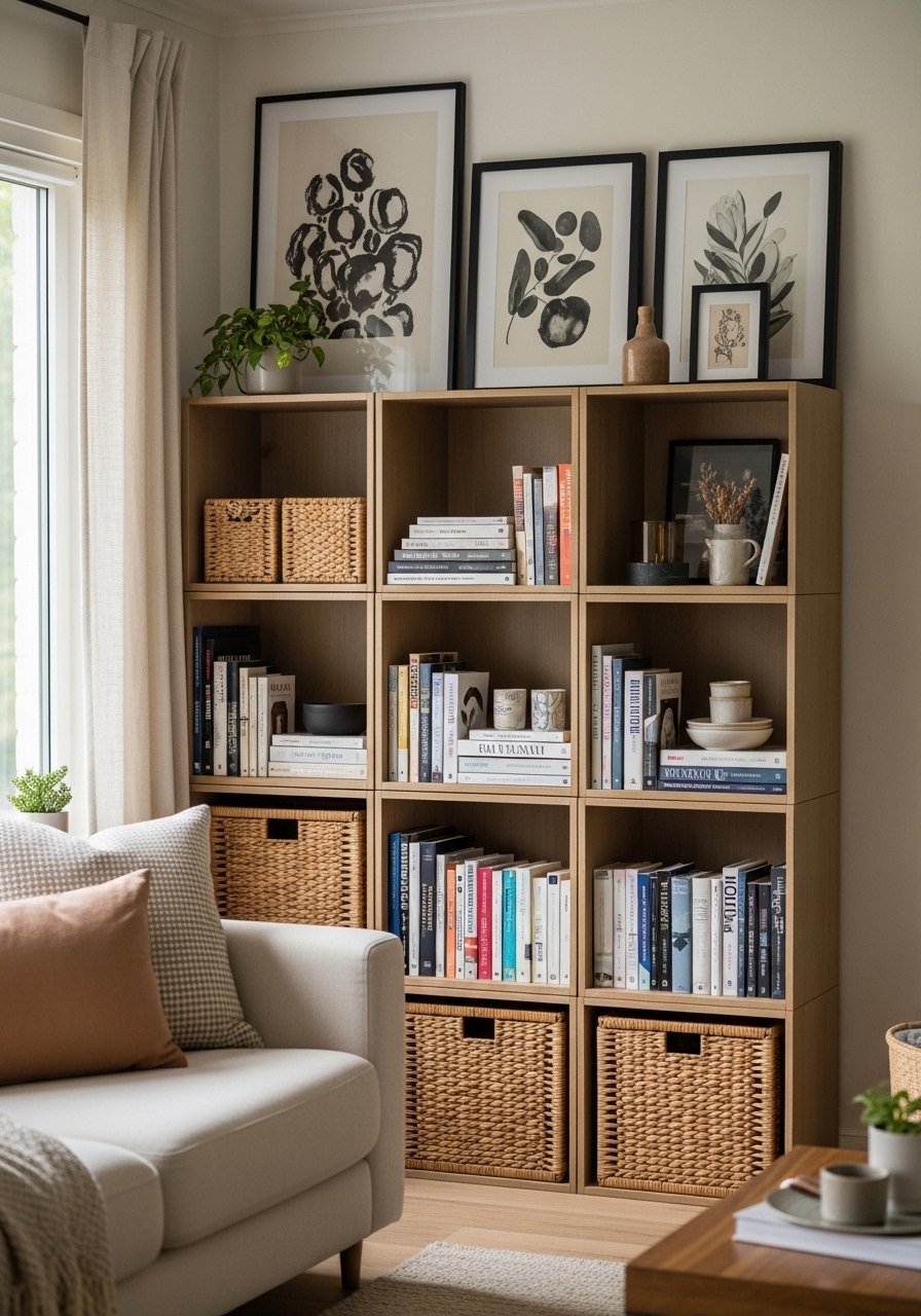
Open shelving that mixes closed baskets, style boxes, and staggered art keeps clutter curated instead of chaotic. Aim for a 30 to 40 percent closed storage ratio so the display breathes. Use identical baskets or bins to hide cords and remotes and alternate with stacks of books laid flat for visual weight. This approach fits renters because most modular units bolt to the wall but can be uninstalled later. After trying this in three rentals I learned that identical basket textures are the secret to a coherent shelf.
Mistake to Avoid: Filling every shelf to the brim, which turns the display into a mess rather than a composition.
6. Acoustic Art Panels That Double As Decor
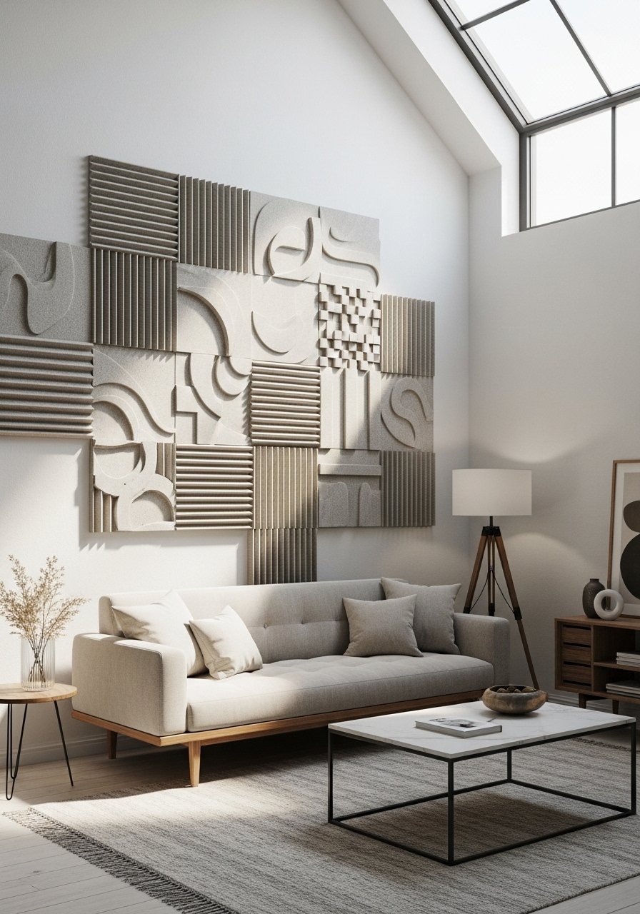
If your space is echoey, use acoustic panels covered in fabric to tame sound and add color. Arrange them as a grid or staggered composition, and treat the center of the installation at about 57 inches off the floor for best eye-line balance. The panels reduce room reverb and create a gallery-style statement that other decorators often miss. Choose contrast fabric on two panels for a subtle focal point. This is especially useful in open-plan apartments or rooms with hard floors.
Mistake to Avoid: Hiding acoustic needs behind soft furnishings only, which leaves the overall sound poor and the space unmanaged.
7. Sculptural Coffee Table, One Centerpiece
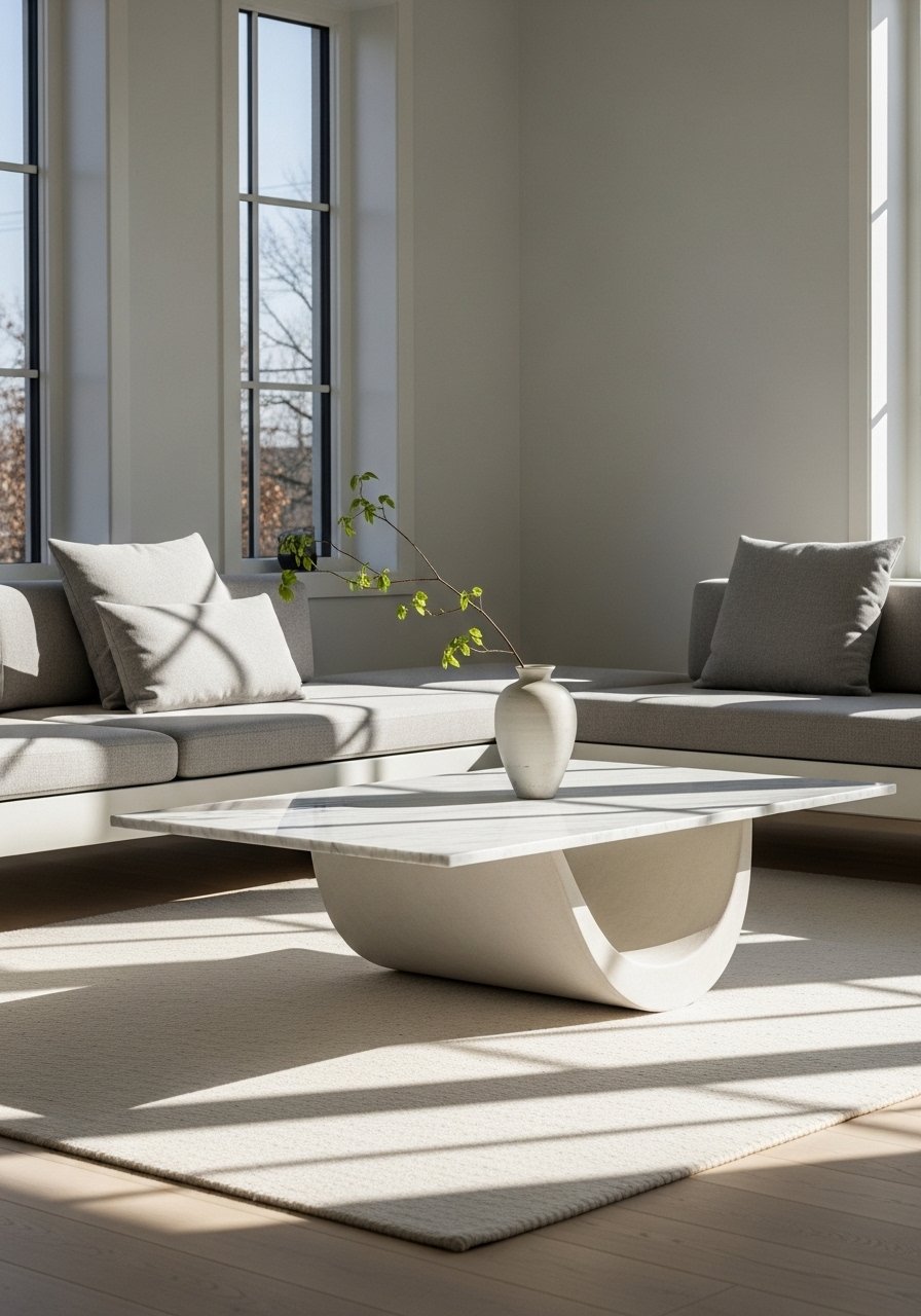
A single sculptural coffee table reads edited and modern, and it becomes the room's centerpiece. Opt for a table around 18 inches high if your seating is low, and leave roughly 12 to 18 inches between the table and sofa for circulation. The table material—stone, molded resin, or turned wood—sets the tone. Keep accessories minimal: one tray, one book, and a small vessel. It creates a gallery feel without needing a full staging budget.
Mistake to Avoid: Crowding the table with many small objects that look like clutter in photos and everyday life.
If any of these ideas have you ready to actually try something, here are the pieces I reach for most.
Foundational Living Room Buys
Textiles & Soft Goods:
- Linen throw (~$30-70). A soft neutral throw that layers well with patterns.
- Velvet pillow covers (~$12-20 each). Swap seasonally for texture changes.
Furniture Anchors:
- Low-profile sectional (~$700-1500). Look for rounded corners and a 17 to 18 inch seat height.
- Sculptural coffee table (~$150-600). One statement piece anchors the room.
Lighting & Hardware:
- Dimmable LED strip kit (~$20-60). Use in cove moulding for ambient light.
- Adjustable floor lamp (~$80-240). A dimmable lamp for layered lighting.
Styling Extras:
- Woven storage baskets (~$25-60). For open shelving concealment.
- Acoustic panel tiles (~$40-120). Fabric-covered panels that look like art.
8. Built-In Media Console Styling
A built-in or floating media console looks custom and keeps the room tidy. Paint the face a single, slightly darker tone than the wall to give the console presence yet keep it subtle. Keep cables hidden and place a low, wide art piece above the TV, leaving a 3 to 6 inch frame gap to avoid crowding. Use two small decorative stacks on one side and negative space on the other to make the styling feel intentional. This is a renter-friendly look if you choose freestanding consoles that mimic built-ins.
Mistake to Avoid: Overdecorating the console top, which competes with the screen and makes the area feel noisy.
9. Indoor-Outdoor Texture Mix
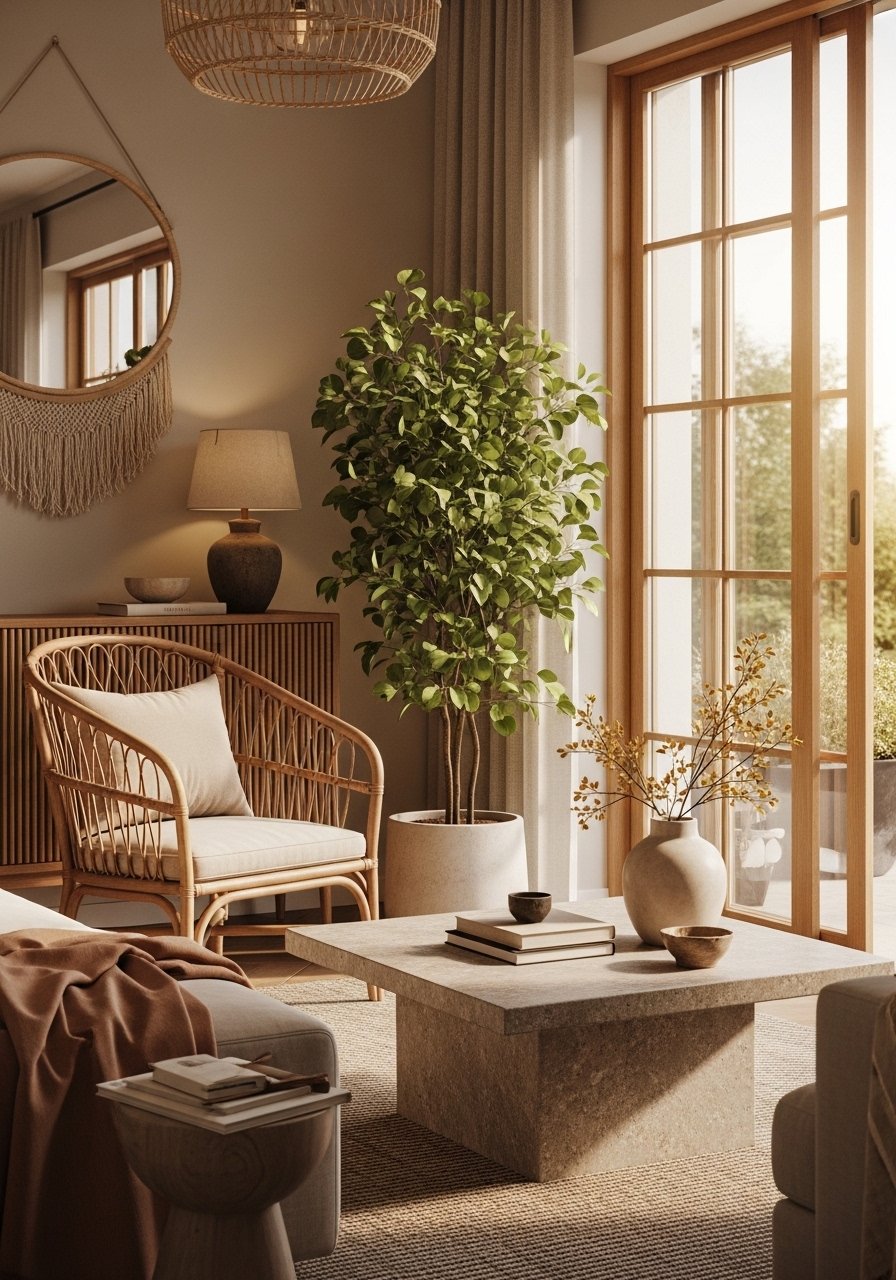
Mixing an outdoor material such as rattan or teak with indoor upholstery creates a collected modern look. Use one statement outdoor piece, like a woven accent chair, and ground it with indoor rugs and soft cushions. This brings tactile contrast and prevents everything from looking designed in the same factory. It is also practical for busy households since outdoor materials clean well and stand up to wear.
Mistake to Avoid: Mixing too many natural textures at once, which can make the room read rustic instead of refined.
10. Curated Minimal Gallery Ledge
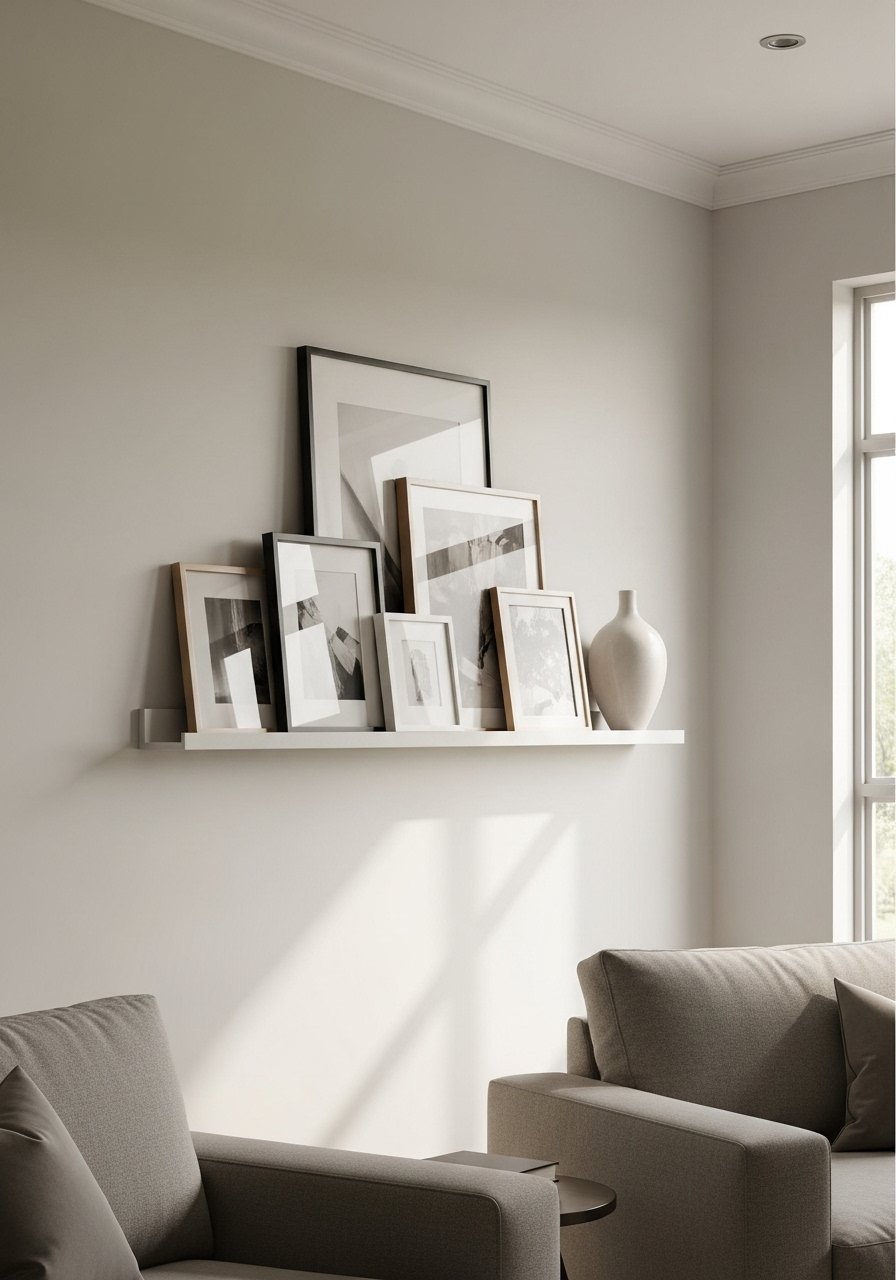
A single gallery ledge lets you rotate art and photos without damaging walls every season. Place the ledge so the center of the art sits around 57 inches high. Layer smaller frames in front of larger unframed canvases for depth. This is one of those swaps that makes a wall feel edited rather than blank. It also simplifies styling because you can shuffle pieces until the composition clicks without rehanging nails.
Mistake to Avoid: Hanging art too high with the top edge at eye level, which makes pieces seem disconnected from furniture.
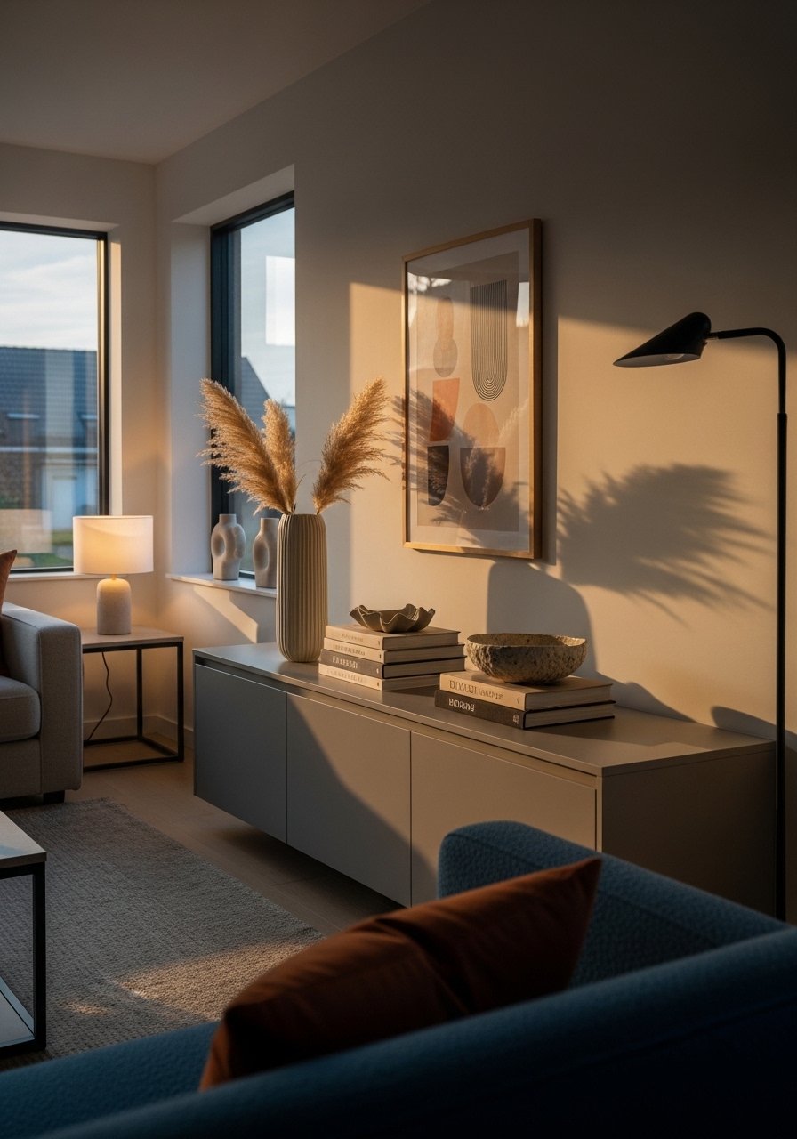
11. Statement Floor Lamp With Dimmer
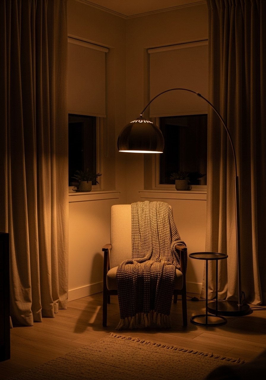
A single sculptural floor lamp provides both function and form and removes the need for multiple table lamps. Choose a dimmer or smart bulb so the lamp handles both task and mood. Put the lamp so it lights the reading chair and spills light toward the coffee table. This one fixture simplifies layering and frees up surfaces for fewer decorative items.
Mistake to Avoid: Selecting a lamp that throws harsh direct light without a shade, which creates glare on screens and mirrors.
12. Pouf And Floor Cushion Corner
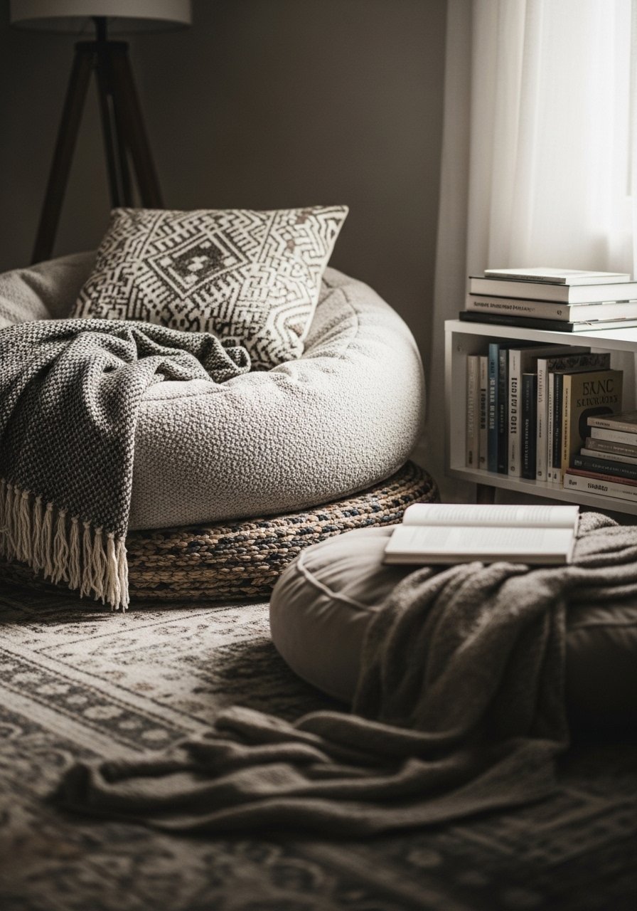
An oversized pouf anchors a casual corner and doubles as a coffee table when needed. Choose a pouf around 18 to 20 inches high to match sofa seat height. Use an easy-wash cover for kid-friendly durability. This adds a relaxed vibe that invites people to drop into the room without feeling formal. Mix a leather pouf with a soft knit cushion to add contrast.
Mistake to Avoid: Picking a pouf that is too small or too firm, which makes it unusable as a seat.
13. Green Corner With Low-Light Plants
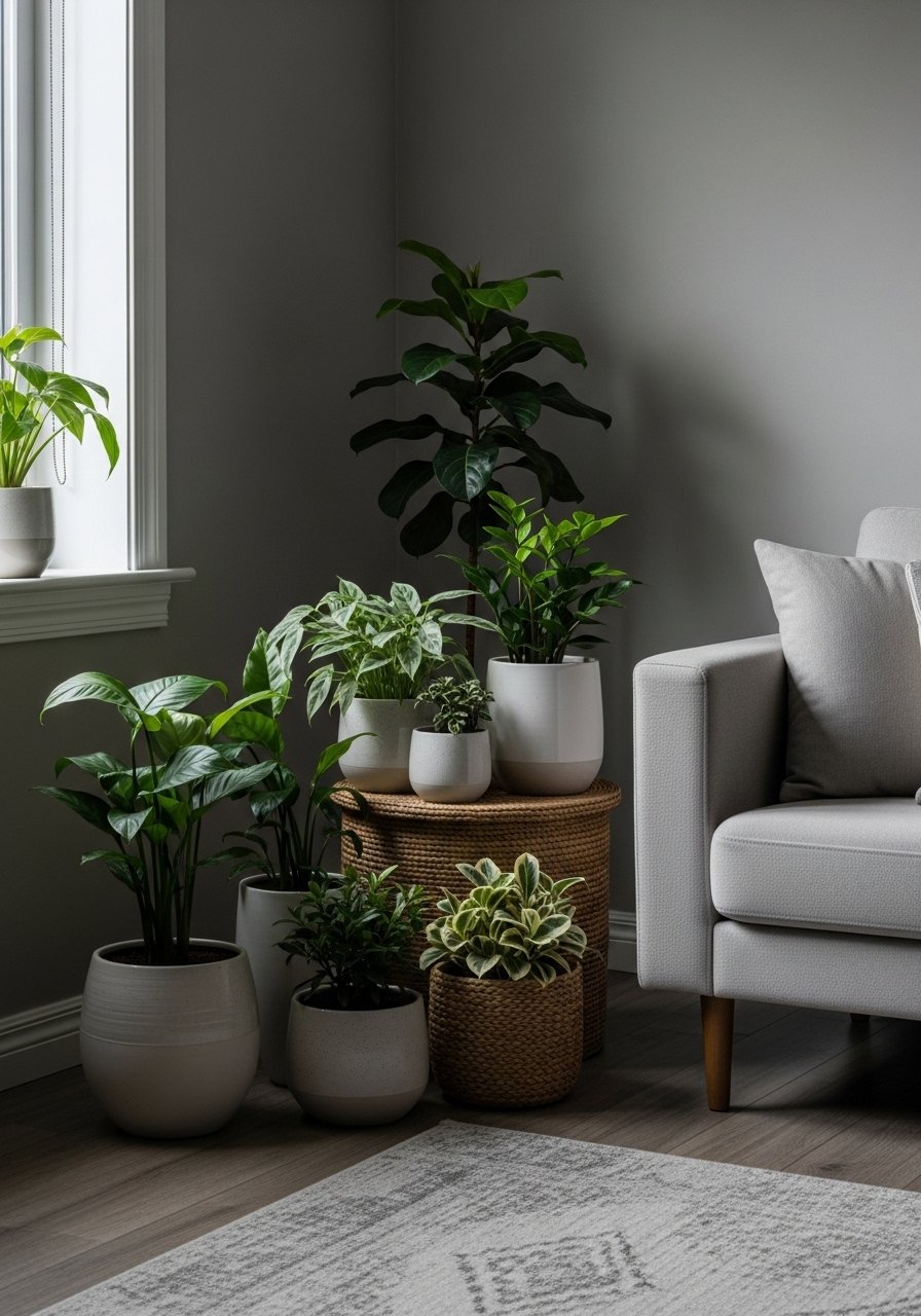
A dedicated plant corner livens the room and adds depth through living texture. Pick low-light tolerant plants such as ZZ plant, snake plant, or pothos if you have indirect sun. Vary pot height and material, and use a tray or stand to group them so watering is contained. A green corner reads intentional and softens modern edges without requiring perfect sunlight or a big budget.
Mistake to Avoid: Grouping only tall plants of the same height, which looks unplanned instead of layered.
Small Living Room Hacks
Thin coats beat one thick coat every time. Three thin layers of multi-surface paint give better coverage on walls or cabinets than one heavy swipe.
Grab velvet pillow covers for about $12 each. Swapping them seasonally changes the room without a full redecoration.
If you have a small rug, pull it under the front legs of the sofa and add a second rug at 50 to 70 percent scale. A natural fiber rug holds up to foot traffic and layers well.
Everyone piles small objects on the coffee table. One single decorative tray keeps items contained and reads cleaner than scattered accessories.