
I kept asking my artist for the tiniest script I could imagine, then watched the letters bleed into one soft smudge over the first year. It took a painful touch-up and a long conversation about spacing, needle size, and font weight to realize smaller is not always better. The trick is picking lettering that reads well close up and stays readable as it heals.
These are small lettering ideas meant for people who want discreet, readable ink that can be covered for work and still feel personal. Expect low to moderate pain and short sessions. I picked options that work on thin skin and thicker skin, across five shops I have visited, so you get choices for different placements, budgets, and aftercare routines.
1. Fine Single-Line Script
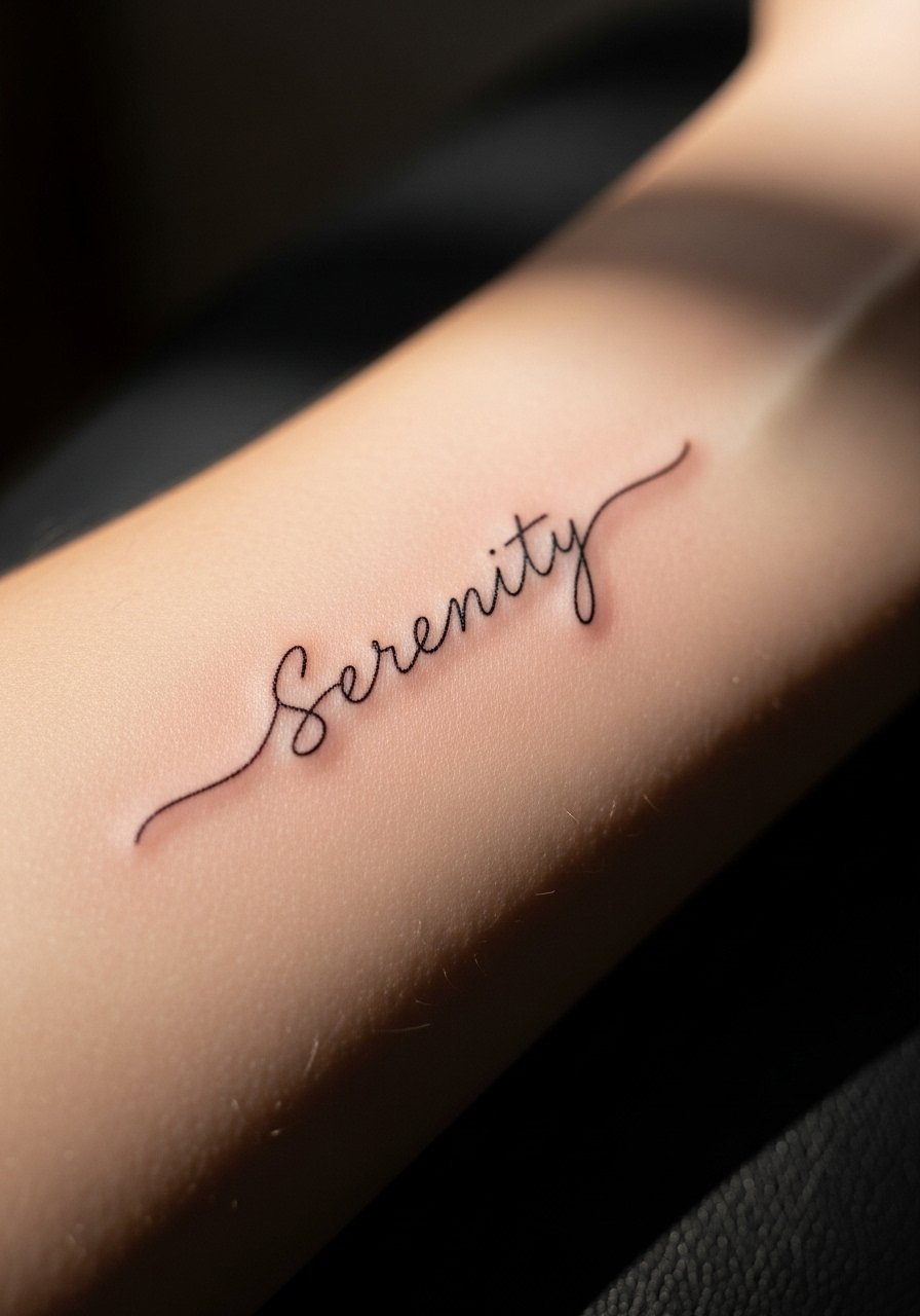
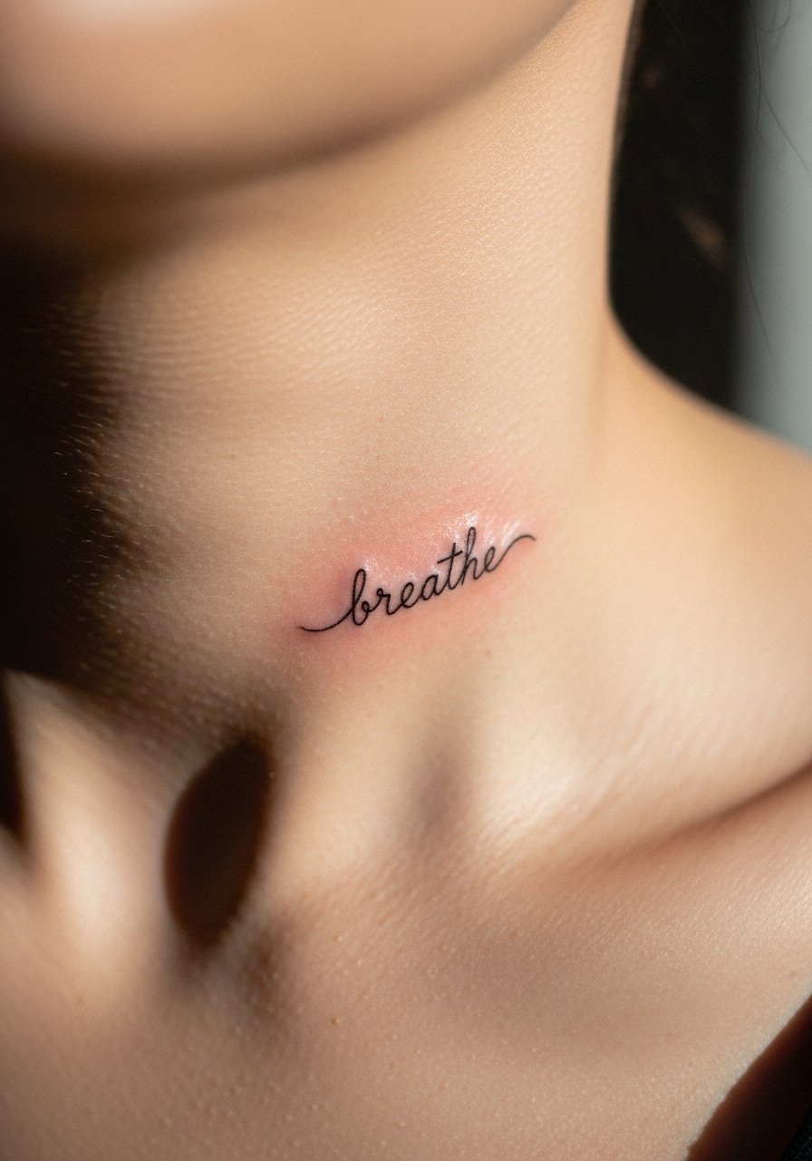
A single continuous hairline script looks delicate and modern because it uses one unbroken stroke. It reads as hand-lettered rather than clipped type, and it suits anyone who wants a coverable wrist, behind-ear, or rib tattoo. Expect a short session and ask for a size that leaves at least 2 to 3 millimeters of negative space between letters to avoid blurring over time. Bring a clear reference and let the artist adjust kerning on stencil. I bring a small tube of tattoo aftercare ointment for healing and a stencil transfer paper if you like to mock up placement at home.
Style/Technique: Fine single-line script
Pain Level: 2/10
Session Time: 0.25 to 0.75 hours
Best For: Inner wrist, behind ear, ankle, people wanting subtle text
Mistake to Avoid: Asking for letters so thin they leave less than 2 mm between strokes, which will blur as the ink settles.
2. Micro-Type with Slight Bolding
Micro-type is tiny, but adding a tiny bit of bolding to stems preserves legibility. The effect reads crisp in photos and in person because the thicker parts catch ink better in the dermis. This is a good pick for names, short dates, or a single word you want on a finger, outer forearm, or behind the collarbone. Ask your artist for a 0.5 to 0.7 mm line weight for small type and expect a brief touch-up window. Pack a gentle fragrance-free soap for cleaning during the first week and a thin tattoo healing balm to lock moisture.
Style/Technique: Micro-type with slight bolding
Pain Level: 3/10
Session Time: 0.25 to 0.5 hours
Best For: Fingers, side of hand, upper rib, people who read fine details
Mistake to Avoid: Insisting on hairline-only strokes when your chosen placement moves a lot, which makes ink spread faster.
3. Single-Word Serif Accent
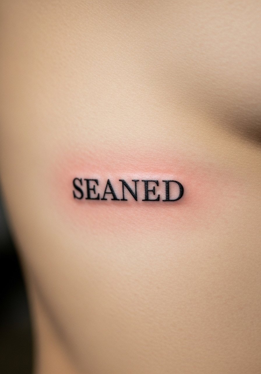
A short serif word—two to four letters—with tiny bracketed serifs adds character without taking space. Serifs give the eye a tiny anchor so the word stays readable as the skin ages. This suits a collarbone, rib, or inner bicep and works for names or short mottos. It costs a little more than plain script because of precision, but the session is still quick. Bring a printed font sample and ask for a slightly larger x-height than you expect. I use a travel-size mirror to check how placement reads from different angles and a paper towel pack to blot during healing.
Style/Technique: Small serif word
Pain Level: 3/10
Session Time: 0.25 to 0.75 hours
Best For: Collarbone, rib, inner bicep, people who prefer classic lettering
Mistake to Avoid: Choosing a serif with overly ornate terminals that lose shape once the skin swells.
4. Typewriter Font Initials
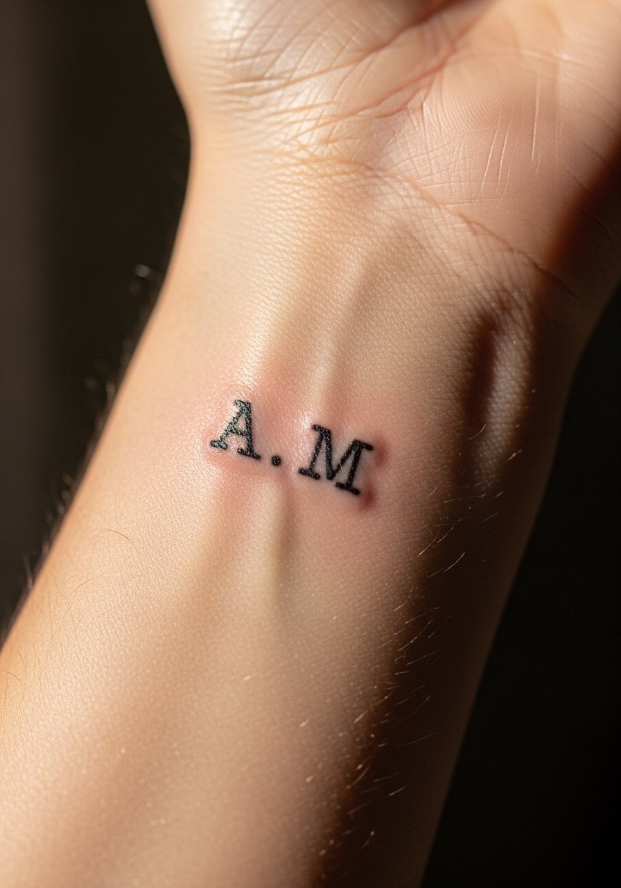
Initials in a typewriter font read clear and vintage without shouting. The small monospaced letters are forgiving because they use short, consistent strokes that age evenly. This is low-budget, low-commitment, and easy to place on a wrist, ankle, or behind the ear. Ask for slightly more spacing than the stencil shows because tiny typefaces often look cramped once healed. I carry a small stencil ruler when comparing placement and recommend a thin layer of antibacterial soap for the first few days.
Style/Technique: Typewriter initials
Pain Level: 2/10
Session Time: 0.15 to 0.4 hours
Best For: Inner wrist, ankle, behind ear, people who like retro minimalism
Mistake to Avoid: Letting the stencil sit too low on the skin without a placement test, which can warp how the letters align.
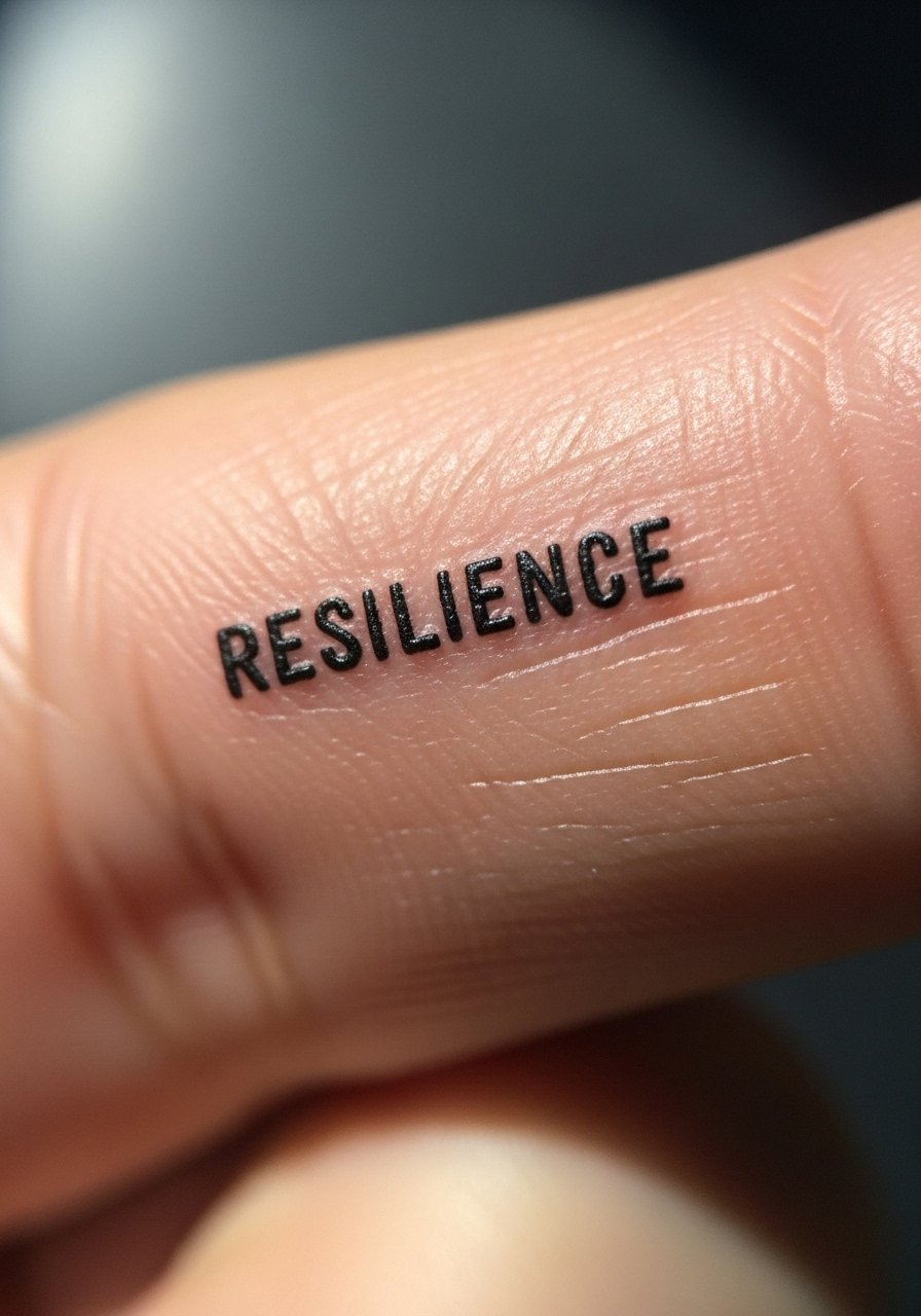
5. Tiny All-Caps Block
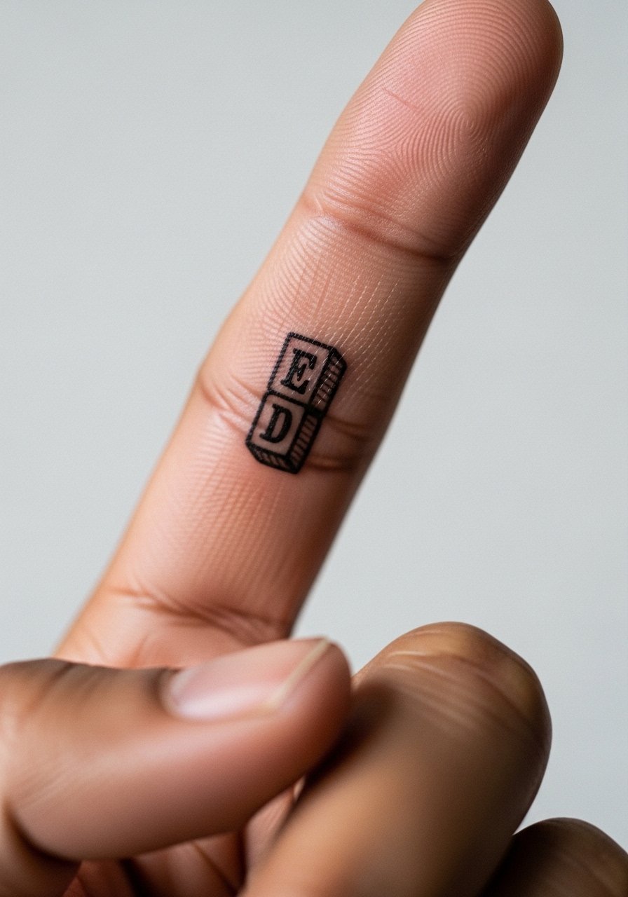
All-caps block lettering gives a little more presence while staying compact. The uniform stroke weight helps letters hold over time, especially in high-movement areas like fingers and knuckles. This is the choice for initials, a zip code, or a short word with visual impact. Budget is modest and the session is short, but fingers may require touch-ups. I bring a tiny bandage kit for the first day and recommend a cotton-glove pair if you sleep with your hands under a pillow.
Style/Technique: Small all-caps block
Pain Level: 4/10
Session Time: 0.2 to 0.5 hours
Best For: Fingers, knuckles, narrow vertical placements, people who want legible short text
Mistake to Avoid: Picking full caps at too-small scale, which makes letters look like a single dark blob after healing.
6. Script with Slight Flourish
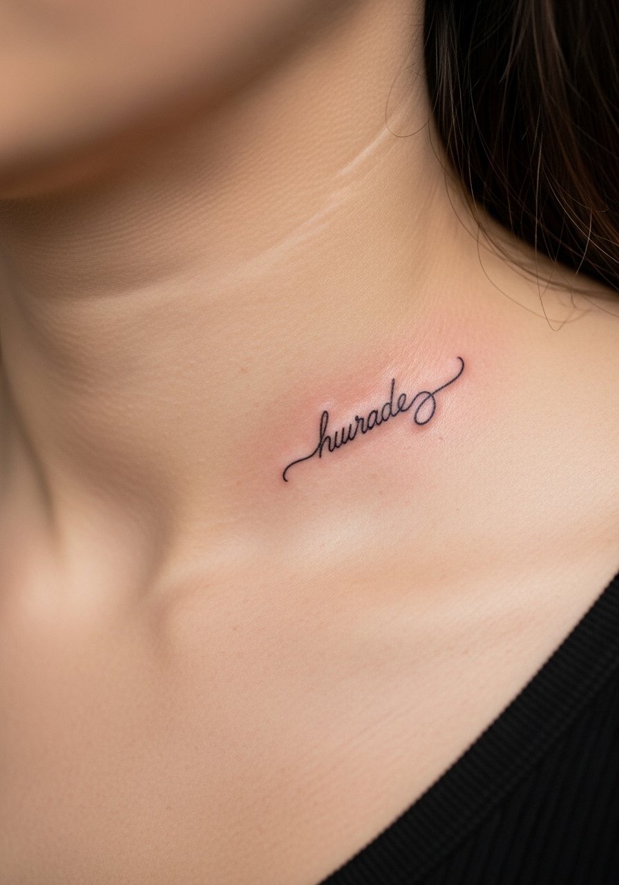
A small script with one measured flourish—like a tail on the final letter—adds personality without turning into a decorative piece. The flourish should be minimal, curved, and no larger than the height of the letters so it does not merge while healing. It gives a slightly romantic feel and works well on the collarbone, shoulder blade, or inner forearm. Expect a modest price bump for precise linework. I buy a soft silicone scar sheet for later smoothing and a gentle unscented lotion for daily maintenance.
Style/Technique: Script with small flourish
Pain Level: 3/10
Session Time: 0.25 to 0.75 hours
Best For: Collarbone, inner forearm, people who want a hint of flourish
Mistake to Avoid: Requesting long ornamental flourishes that travel over moving skin, which can distort quickly.
7. Tiny Vertical Lettering Strip
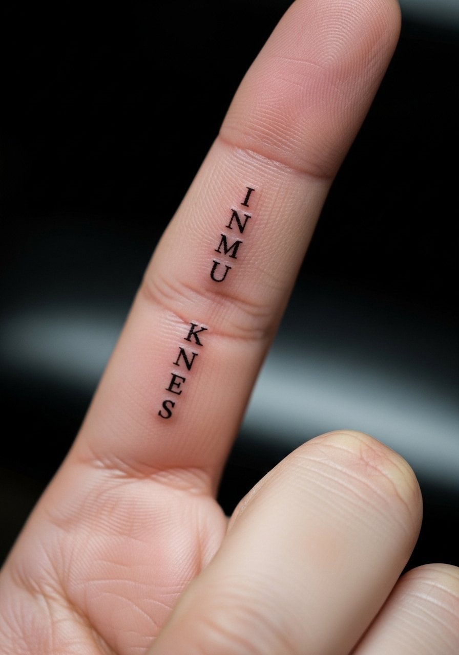
Vertical lettering uses stacked letters to fit narrow real estate while keeping each character larger than horizontal tiny type. It reads well on ribs, the side of the finger, or the spine of the neck. The vertical layout asks for even kerning so letters do not appear crowded in the final view. This is a good option for short words and some script-to-type hybrids. Bring a stencil printed at scale and ask the artist to mark natural body lines to keep the strip aligned. I recommend a travel mirror to preview the vertical read.
Style/Technique: Vertical stacked letters
Pain Level: 3/10
Session Time: 0.3 to 0.8 hours
Best For: Side of finger, spine of neck, ribs, people who need narrow placement
Mistake to Avoid: Stacking too many characters into a tight vertical column, which becomes unreadable fast.
If any of these ideas have you ready to actually try something, here are the supplies I keep on hand before and after a session.
Small Lettering Starter Kit
Aftercare Essentials:
- Tattoo aftercare ointment (~$8-15). Use during the first week to keep the skin hydrated.
- Fragrance-free gentle soap (~$6-12). For daily cleansing while healing.
Stencil & Prep:
- Stencil transfer paper (~$6-12). For checking placement at home.
- Stencil measuring ruler (~$5-10). Helps center tiny words.
Comfort & Care:
- Travel bandage kit (~$8-14). For the first day after getting tattooed.
- Unscented lotion (~$6-12). For ongoing moisture once healing finishes.
- Silicone scar sheet (~$12-25). For smoothing older tiny text if needed.
8. Tiny Cursive Loop
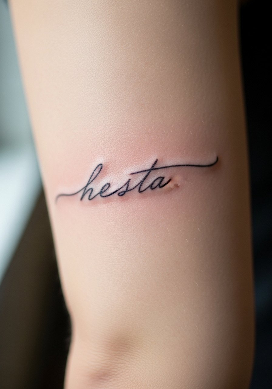
A petite cursive loop with connected letters reads soft and personal because the joined strokes mimic handwriting. It suits inner elbow, underbust, and behind-the-knee placements that allow the script some motion. Ask for slightly more open counters and a moderate line weight so loops do not fill in. This style works well for people who like script but worry about durability. Pack a gentle soap bar and a lightweight healing balm for the aftercare routine.
Style/Technique: Small connected cursive
Pain Level: 3/10
Session Time: 0.25 to 0.6 hours
Best For: Inner elbow, underbust, people who want handwritten vibes
Mistake to Avoid: Choosing ultra-tight loops that touch each other, which causes the letters to merge as the skin settles.
9. Minimal Gothic Letter
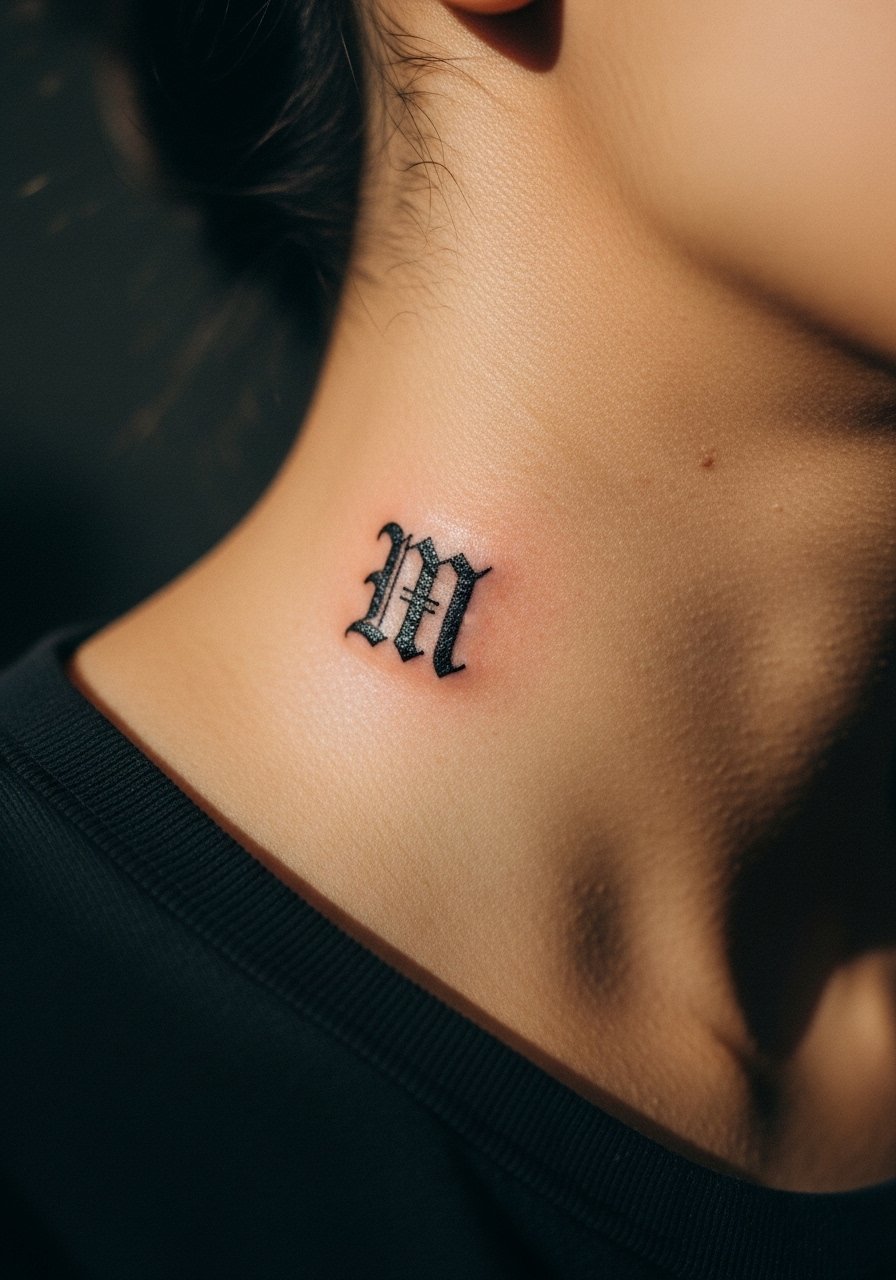
A single minimal gothic letter keeps the mood of blackletter without the heavy ink load of full gothic words. The condensed shapes and angular terminals read bold but small. It is a good option for a single initial on the neck, behind the ear, or at the base of the thumb. Expect a precise stencil and slightly longer session if the artist needs to map tiny angles. I recommend a small touch-up kit for fingers and neck placements that take more wear.
Style/Technique: Minimal gothic initial
Pain Level: 3/10
Session Time: 0.2 to 0.6 hours
Best For: Neck, behind ear, thumb, people who want a hint of edge
Mistake to Avoid: Asking for full black fills in tiny gothic terminals, which can blur into blobs over time.
10. Micro-Calligraphy Word
Micro-calligraphy borrows thick-to-thin stroke contrast from traditional calligraphy but keeps scale tiny. The contrast helps letters breathe and prevents them from reading like a single gray mark. This works well for a collarbone, lower forearm, or the top of the foot. It takes a steady hand from a skilled artist, so budget a bit higher and choose someone experienced with fine contrast. I pack a small mirror for placement checks and a tube of healing salve for the first week.
Style/Technique: Micro-calligraphy word
Pain Level: 3/10
Session Time: 0.3 to 0.9 hours
Best For: Collarbone, forearm, top of foot, people who want elegant contrast
Mistake to Avoid: Choosing extreme stroke contrast at too-small a scale, which loses the thin strokes entirely as the ink spreads.
11. Tiny Script with Dot Accents
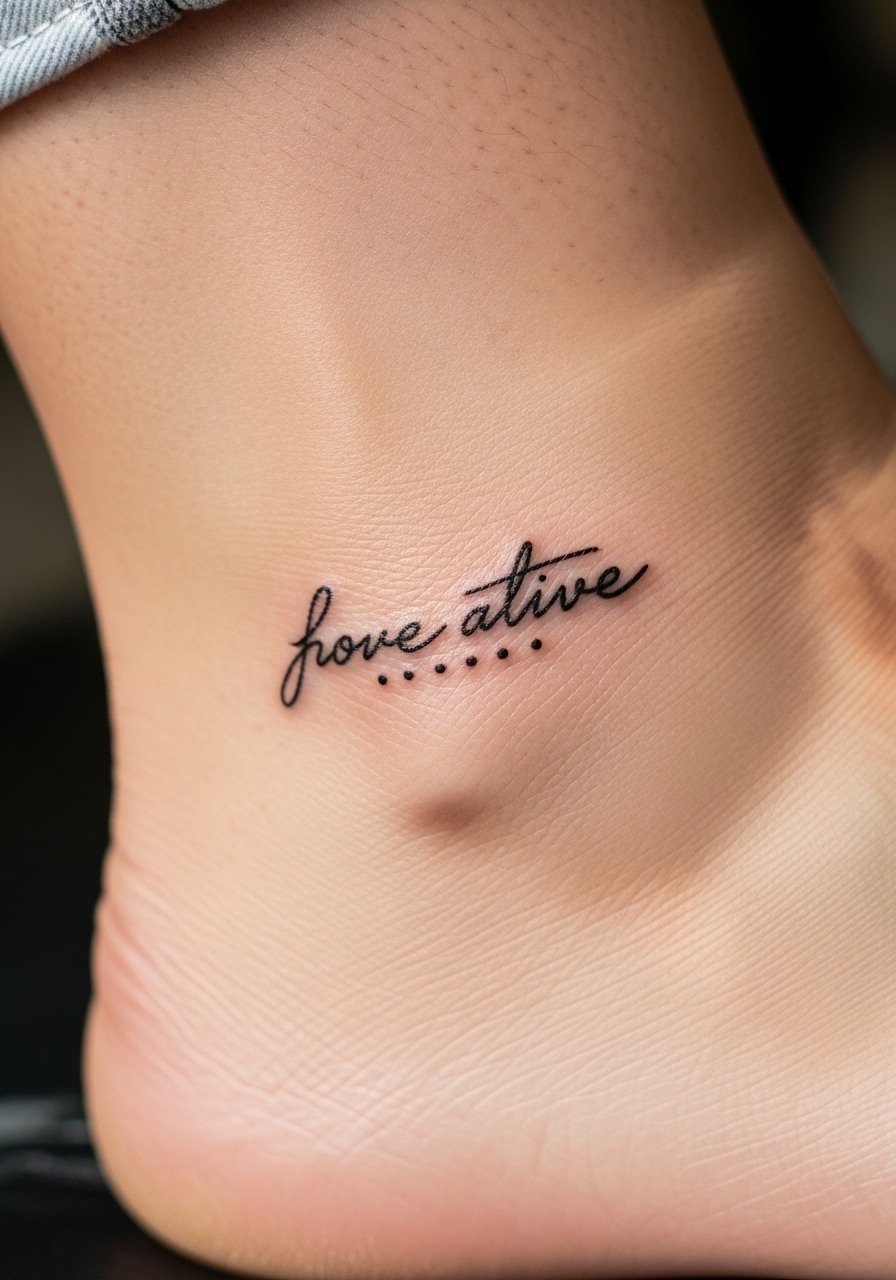
Adding tiny dot accents beneath or beside letters gives a subtle decorative cue that ages well because dots hold pigment differently than lines. This offers personality without extra scale. It works on ankles, behind the ear, and wrists. Dotting is low-cost and low-time but ask for consistent dot size and spacing so the pattern does not look accidental. Keep a pack of unscented wipes for light cleaning and a small adhesive bandage pack for the first night.
Style/Technique: Script with dot accents
Pain Level: 2/10
Session Time: 0.2 to 0.5 hours
Best For: Ankle, behind ear, wrist, people who want tiny decoration
Mistake to Avoid: Requesting irregular dot sizes, which read messy once the skin has scabbed and peeled.
Tiny Lettering Care Habits
Thin coats beat one thick coat every time. When applying aftercare balm, a thin layer of tattoo aftercare ointment prevents clogging pores and keeps scabs soft.
Grab a fragrance-free gentle soap for around $6. Clean twice a day during the first week, gently, not scrubbed, to avoid lifting ink.
If most people pick very small fonts, give yourself a buffer by asking for at least 2 mm of spacing. A tiny stencil transfer paper helps you check that spacing before the needle hits skin.
Start with a travel mirror when previewing placement. Look at the stencil from the angles you will see it daily so you do not end up with a word that only reads in photos.
When in doubt, schedule a short consult call or quick in-person stencil check. Carry a small bandage kit to protect the area that first night.