
The moment it clicked was when my first attempt, a swoopy script that looked fine on paper, blurred into an unreadable knot on my inner wrist. I stopped copying pretty photos and started thinking in millimeters instead, scaling letters to 5 to 8 mm tall, tightening spacing to about 2 to 3 mm, and asking for 0.6 to 1 mm stroke widths. Making those small measurement changes fixed the legibility and made the whole piece feel intentional instead of an afterthought.
These options are for people who want readable wrist lettering, whether you plan a discreet name, a phrase, or a tiny quote. The ideas range from fast sessions for simple monoline fonts to multi-session bespoke calligraphy, and they work for budgets from walk-in studio prices to custom commissions. Across five shops I have visited I noticed the same rule kept coming up, scale and stroke matter more than the font name.
1. Minimal Monoline Script
Monoline script is the easiest to photograph and heal cleanly because every letter uses the same single stroke weight. Visually, it reads like handwriting but holds up on the wrist where skin moves a lot. It feels quiet and wearable, great if you work in a visible-office setting and want something coverable with a watch or bracelet. Expect a short session, often under an hour. Prep with a disposable razor and a gentle soap, and use a fragrance-free tattoo balm during the first two weeks.
Style/Technique: Monoline hand script
Pain Level: 3/10
Session Time: 30 to 60 minutes
Best For: Inner wrist, visible-friendly, first tattoo
Mistake to Avoid: Picking an ultra-delicate stroke and then insisting on very small letters under 4 mm, which will blur as it heals.
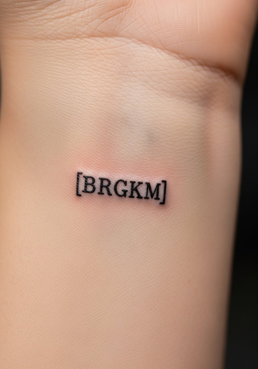
2. Tiny Typewriter Font
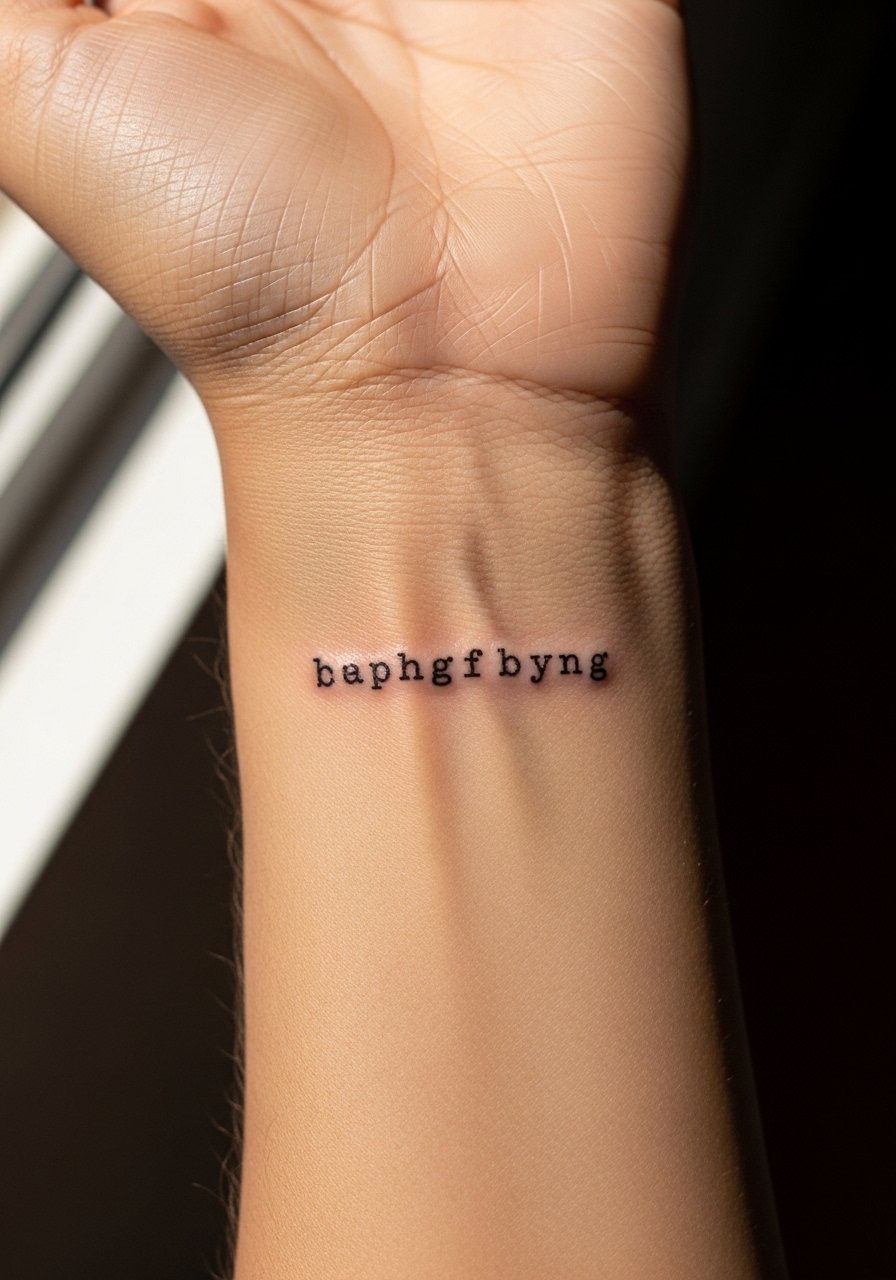
Typewriter lettering uses uniform spacing and small, square letterforms. It reads like a stamped memory and works particularly well for short dates or single words. The visual result is cool and slightly industrial, it fares well in humid climates because the solid shapes resist feathering. Plan for letters at least 4 to 5 mm tall with 1 to 1.5 mm stroke width. If you want the exact pixel feel, bring a printed sample and ask the artist to map the letter baseline to the wrist curve. Use a micro gauze roll for initial coverage.
Style/Technique: Monospaced tiny type
Pain Level: 2/10
Session Time: 20 to 40 minutes
Best For: Outer wrist, minimalist dates or names
Mistake to Avoid: Choosing letters smaller than 4 mm, which can lose the serif-like terminals and look like blobs after healing.
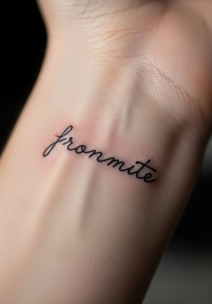
3. Petite Cursive With Ligatures
Petite cursive leans into connected letters and elegant ligatures, giving a sense of motion across the wrist. It reads softer than block text and suits people after a more personal, handwritten feel. Because curves cross the wrist crease, specify slightly taller x-heights, around 6 to 8 mm, so loops do not disappear into folds when you bend your hand. Healing can soften thin joins, so a small touch-up is common. Keep a gentle saline wound wash on hand during the first week.
Style/Technique: Small cursive with ligatures
Pain Level: 4/10
Session Time: 30 to 60 minutes
Best For: Inner wrist, personal phrases
Mistake to Avoid: Asking for ultra-thin ligatures without allowing for 0.8 mm minimum stroke width, which can break up while healing.
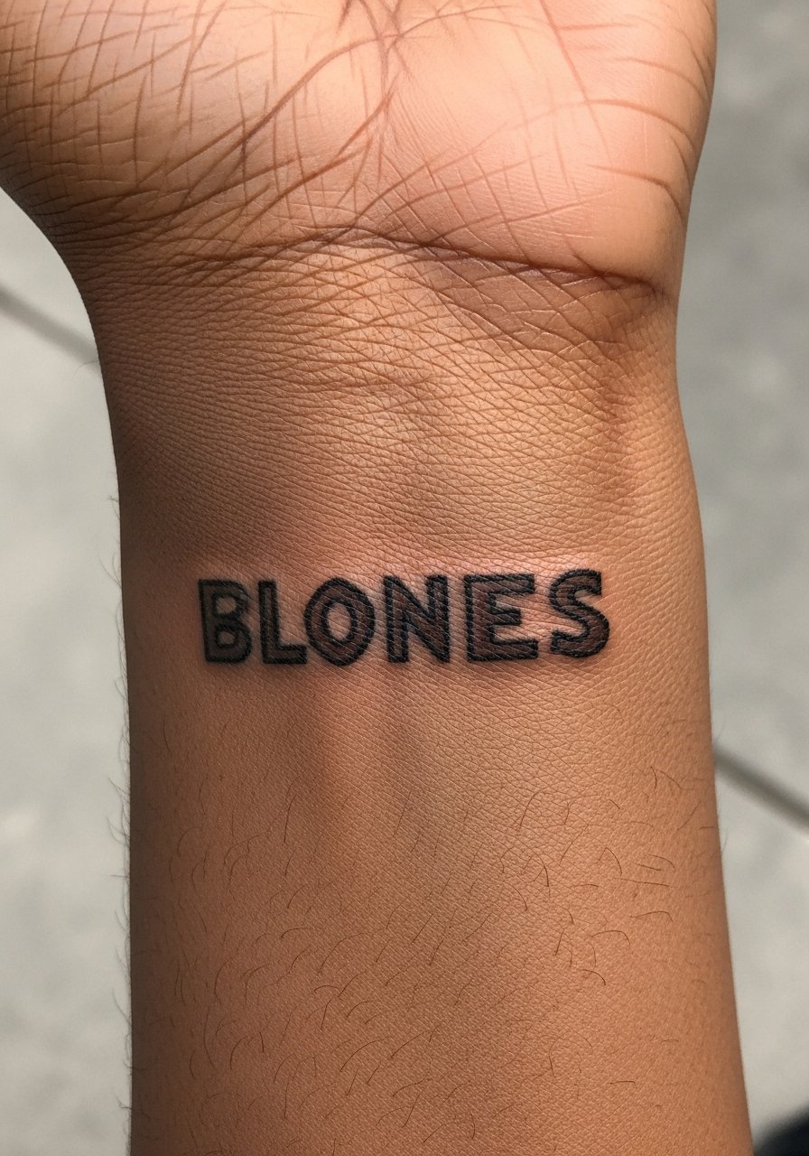
4. Block Capitals, Narrow Condensed
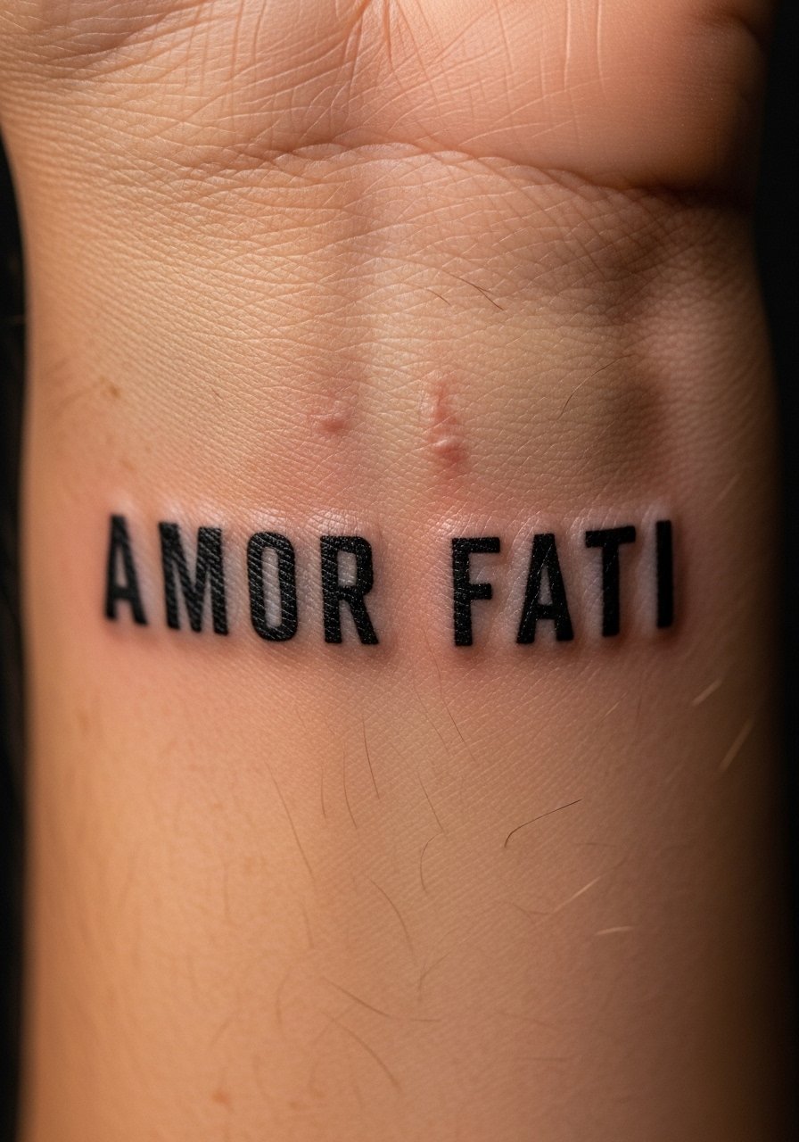
Condensed block capitals give a punchy, graphic look with tight letter spacing that still reads at small sizes. They are ideal for short words or acronyms and age well because the strokes are usually wider, around 1 to 1.5 mm. Ask the artist to slightly increase counter space so letters like A, O, and R do not fill in as the tattoo heals. This style is low maintenance and suits medium skill budgets since it can be completed quickly. Pack a silicone scar sheet for later smoothing if raised texture appears.
Style/Technique: Narrow block capitals
Pain Level: 3/10
Session Time: 20 to 45 minutes
Best For: Outer wrist, bold single words
Mistake to Avoid: Requesting extremely tight tracking without compensating for 1 to 2 mm expansion during healing.
5. Typewriter With Negative Space
This approach uses thin outlines or hairlines to define letters while leaving the interior as skin, creating a crisp legibility without heavy ink. It reads clean and modern and is particularly useful if you want to minimize ink saturation for future removals. The trick is to keep hairlines at least 0.7 mm and negative space letters at 5 mm minimum so they do not close up. It pairs well with a broad-spectrum mineral sunscreen stick for long-term color retention.
Style/Technique: Hairline outlines with negative space
Pain Level: 4/10
Session Time: 30 to 60 minutes
Best For: Inner wrist, low-ink longevity
Mistake to Avoid: Choosing overly small negative shapes under 5 mm that will fill in as skin repairs.
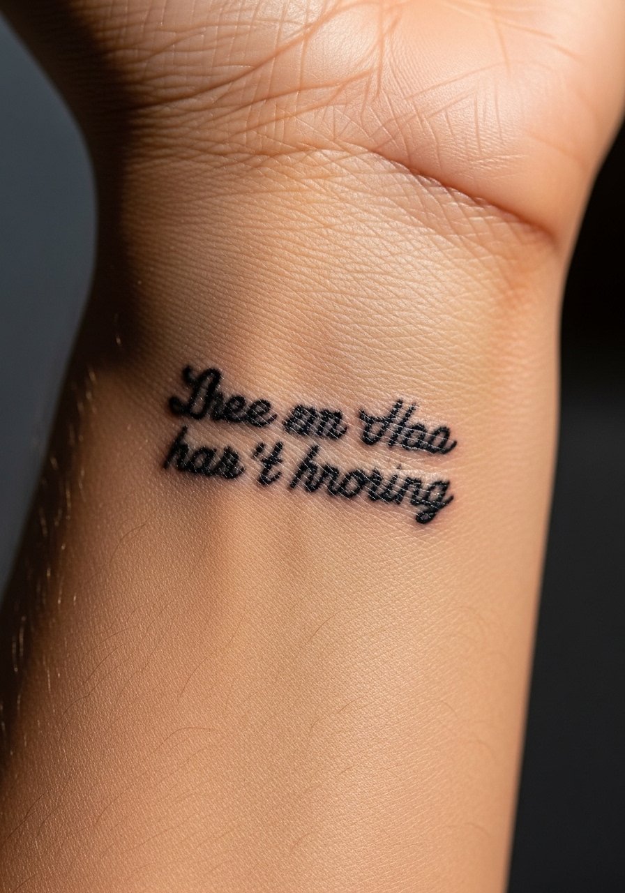
6. Calligraphic Brush Lettering
Brush lettering mimics ink brush strokes with dynamic thicks and thins. It creates drama on a small canvas when the artist reproduces the pressure contrast accurately. For wrists, keep the heaviest strokes capped around 1.5 to 2 mm so they do not blob during healing. This is more of a skilled-artist style and may require a consultation and a practice stencil, which adds to cost. Bring a printed sample and consider a reusable stencil transfer paper to align the lettering with wrist curves.
Style/Technique: Brush calligraphy simulated in ink
Pain Level: 5/10
Session Time: 45 minutes to 1.5 hours
Best For: Inner or outer wrist, expressive single phrases
Mistake to Avoid: Requesting extreme thick contrasts that exceed 2 mm, which tend to blur into puddles while healing.
7. Tiny Gothic Blackletter
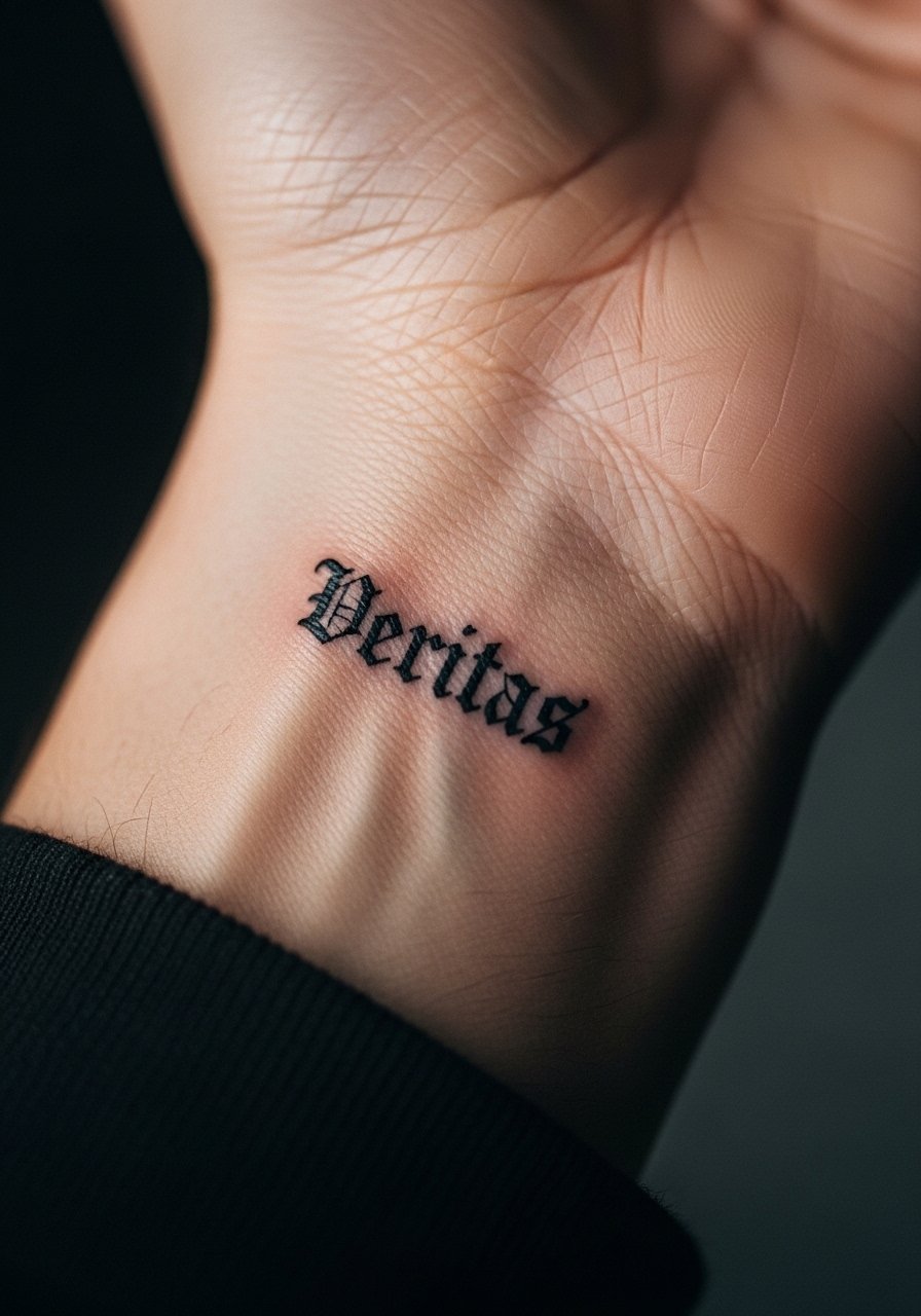
Blackletter on a wrist is a bold choice at small scale. Its dense serifs and sharp angles create a compact block of text that reads like jewelry when done at the right size. For wrist placement, aim for 6 to 9 mm tall letters with 1 to 1.2 mm main strokes to preserve the decorative elements. This style shows wear differently over time, so plan touch-ups every few years. After the first week use a fragrance-free sunscreen lotion to prevent premature fading.
Style/Technique: Miniature Blackletter
Pain Level: 5/10
Session Time: 45 to 90 minutes
Best For: Outer wrist, bold statement words
Mistake to Avoid: Trying to cram ornate Blackletter into 3 to 4 mm height, which erases the gothic details.
If any of these ideas have you ready to actually try something, here are the products I reach for every time.
Wrist Lettering Starter Kit
Aftercare Basics:
- Fragrance-free tattoo balm (~$8-18), for the first two weeks.
- Gentle saline wound wash (~$10-15), helps clean without scrubbing.
- Silicone scar sheet (~$12-20), for smoothing raised spots later.
Prep & Protection:
- Disposable razors (~$6-12), for clean shave before inking.
- Stenciling transfer paper (~$7-14), if you like to test placement at home.
- Broad-spectrum mineral sunscreen stick (~$8-20), for long-term protection.
Practical Extras:
- Micro gauze roll (~$6-12), for light coverage while sleeping.
- Hypoallergenic tattoo tape (~$5-10), useful for short-term waterproofing during showers.
- Small mirror with handle (~$6-15), to check placement before committing.
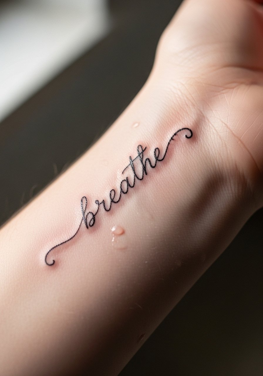
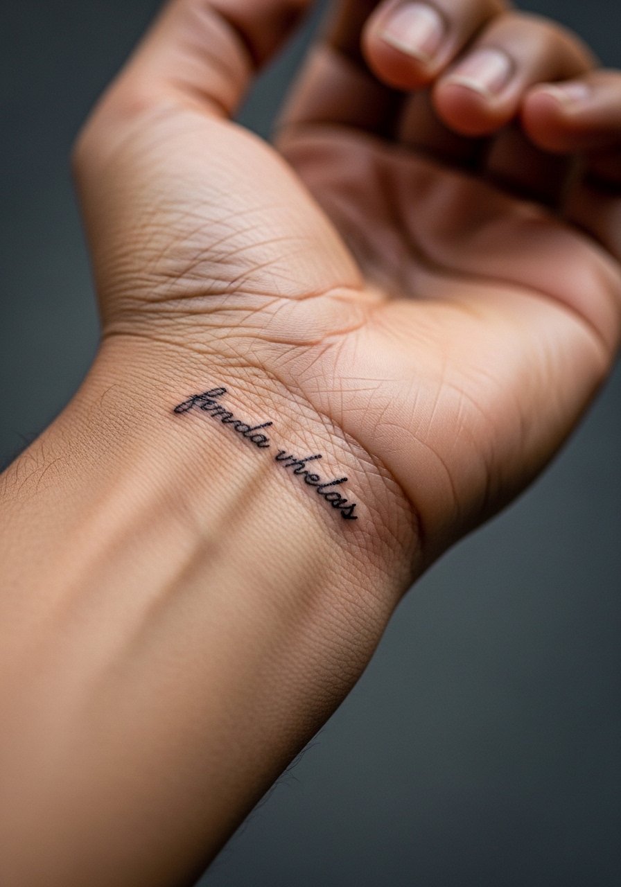
8. Script With Subtle Flourishes
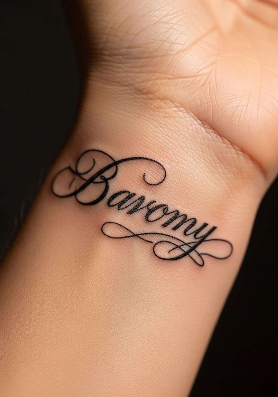
Subtle flourishes add personality without overwhelming a small wrist canvas. They work best when kept to short tails at the start or end of a word rather than looped throughout. Visually the result reads hand-inked and more custom. Ask an artist to keep flourish lengths under 10 to 12 mm so they do not collide with bracelets. This is a mid-skill design, often a single session. I like to finish with a fragrance-free tattoo balm applied thinly twice a day for the first week.
Style/Technique: Script with modest flourishes
Pain Level: 4/10
Session Time: 30 to 60 minutes
Best For: Inner wrist, names or one-line quotes
Mistake to Avoid: Adding flourishes on every letter which makes the text unreadable at small scale.
9. Serif Miniature Typeface
Serif lettering gives a classic, slightly formal look. When reduced to wrist size, the key is gentle serifs and slightly wider main stems, generally 0.9 to 1.2 mm. The feeling is polished and a little vintage, which matches formal names or dates. This style is forgiving if you want to later add ornamentation because the serifs can frame small symbols. Keep a silicone scar sheet if the serif edges thicken during healing.
Style/Technique: Tiny serif typography
Pain Level: 3/10
Session Time: 30 to 60 minutes
Best For: Outer wrist, dates, initials
Mistake to Avoid: Selecting ultra-thin serifs under 0.6 mm that will round out and lose definition.
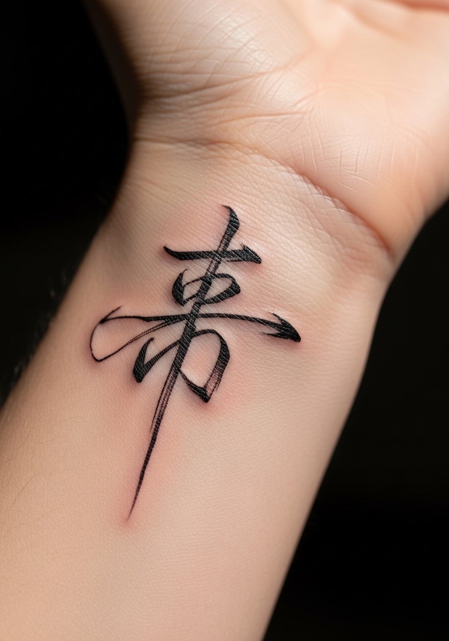
10. Foreign Script, Respectfully Done
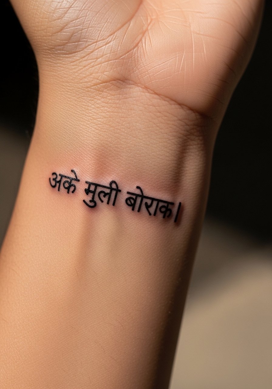
Foreign scripts make powerful personal statements, but cultural context matters. If you choose a script like Arabic, Devanagari, or Chinese characters, research exact phrasing and consult a native speaker. For wrist placement, ask an artist who has documented experience with the script. Letter height should be adjusted to 6 to 9 mm so diacritics do not touch. A cultural-sensitivity check keeps a design meaningful and prevents accidental mistranslation. Carry a printed, verified sample to your appointment.
Style/Technique: Small script in non-Latin alphabet
Pain Level: 4/10
Session Time: 30 to 90 minutes
Best For: Inner wrist, meaningful single phrases
Mistake to Avoid: Relying on auto-translate or a single unverified source for phrasing.
11. Micro Serif With Shadowing

Adding a tiny drop shadow creates subtle depth that reads like a micro 3D effect from close range. The shadow should be no more than 1 to 1.5 mm offset and a lighter ink or diluted gray so it does not overpower the letters. This finish adds presence in photographs and feels slightly vintage. It raises session time and may require a touch-up for consistent shading. Use a small mirror with handle to check placement during consultation.
Style/Technique: Micro serif with soft shadow
Pain Level: 4/10
Session Time: 45 to 90 minutes
Best For: Outer wrist, single words that need pop
Mistake to Avoid: Choosing a heavy offset that competes with the main letterform, making the type look doubled.
12. Stacked Two-Line Phrase
Stacking two tiny lines lets you keep the wrist piece compact while still saying more. Center the text and keep top and bottom lines balanced with 2 to 3 mm of interline space. This layout keeps the phrase organized and prevents letters from running into wrist folds. It is a good choice when a single-line wrap would either be too long or curve awkwardly. Bring a printed layout and a stencil transfer paper sample to test visual weight before the needle touches skin.
Style/Technique: Two-line stacked lettering
Pain Level: 3/10
Session Time: 30 to 60 minutes
Best For: Inner wrist, short quotes split into two parts
Mistake to Avoid: Crowding lines with less than 2 mm leading, which looks messy when you move your wrist.
13. Hidden Back-of-Wrist Script
Putting text on the back of the wrist gives a private, semi-hidden placement that reads when you lift your hand. The contour is flatter here, which helps detailed scripts hold up better. Keep letter heights between 5 and 8 mm and avoid long tails that drag into the hand creases. This spot works for people who want occasional visibility and easy cover with a watch cuff. For aftercare, a micro gauze roll is handy for the first few nights.
Style/Technique: Back-of-wrist small script
Pain Level: 3/10
Session Time: 20 to 45 minutes
Best For: Discreet visibility, semi-private phrases
Mistake to Avoid: Extending flourishes onto the hand where friction will blur edges.
Wrist Tattoo Healing Habits
Thin coats beat one thick coat every time. Apply a thin layer of fragrance-free tattoo balm twice a day. Thick blobs prevent skin from breathing and trap moisture.
Grab stencil transfer paper before the appointment. Testing placement at home on the wrist curve makes every font choice less of a surprise.
If your artist sketches a digital mock, photograph it at arm's length. That gives a realistic size reference, because photos taken close up make letters look larger than they are.
Most people scrubbing too hard is the problem. Use a gentle saline wash and pat dry, not rub. Micro gauze roll works better than cotton when you need coverage.